Customizing Charts
|
|
Customizing Charts |
|
Types of Charts |
|
Introduction |
|
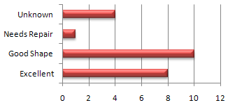
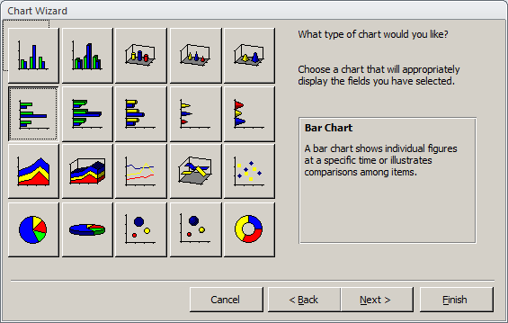
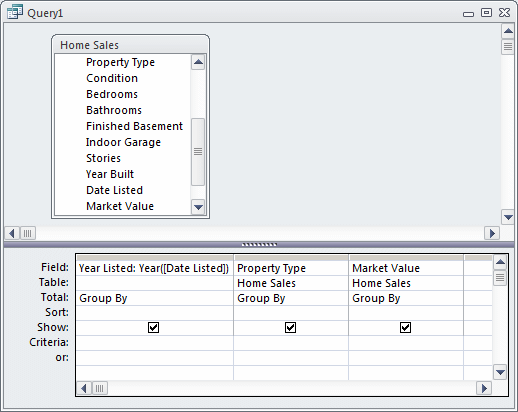
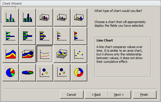
In our introduction to charts, we created one with standing rectangular boxes. This is called a column chart and is only one of the types of charts available. Microsoft Access (indeed Microsoft Office) provides many other flavors you can use, depending on the type of analysis you want to perform. When starting a (new) chart, in the third page of the wizard, you can select the type of chart you want. After the chart has been created, you may prefer another type of chart. In most cases, you can change the type of chart, easily. |
A chart created with all default settings usually accomplishes its purpose of helping you analyze data and figures, but the default features are set only as starting points. All the formatting and emphasis needs are left up to you.
Besides the values and numbers on it, a chart is a graphic object whose characteristics can be enhanced to accentuate special important points. Most aspects of a chart can be changed.
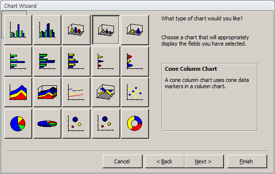
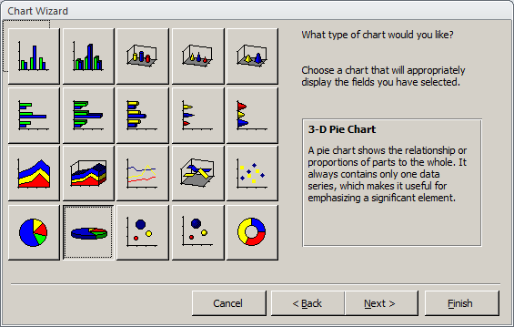
The Chart Wizard is equipped with various kinds of charts. In each category, different sub-types are used to accomplish a unique purpose. Although they share a lot of characteristics, some charts in the sub-type can tremendously change or alter the intended goal. You should know what options are available, and then act accordingly.
To actually change a chart, after displaying its parent form or report in Design View, you can double-click it. This would open the Microsoft Graph application. From there, you can right-click any part of the chart to make the necessary changes. Any area you right-click presents a particular menu.
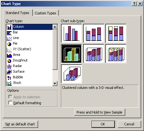
To change the type of chart, you can right-click an area of the chart and click Chart Type. This would open the Chart Type dialog box. It presents the various available types of charts and you can click one of them. If none of the available types suits you, you can click the Custom Type tab for more options.
![]() Practical
Learning: Changing a Chart Type
Practical
Learning: Changing a Chart Type
|
The Types of Values of a Chart |
When you select the values of a table or a query and ask Microsoft Graph to use them to create a graph, by default, the application counts the number of occurrences of each value, especially if you select a string-based field. Depending on the type of chart as we will see in the next few sections, some charts can use regular numbers while some others are better with percentage values. Fortunately, instead of trying to figure out how to perform the calculations yourself, Microsoft Graph can do it for you.
Types of Charts: Column Charts
|
Introduction |
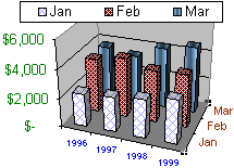 |
As we have seen already, a column chart creates vertically standing rectangular boxes. Each box can be used to represent an integral, a decimal, or a percentage value. When creating such a chart, you specify the values to use. Microsoft Graph determines the highest and the lowest values. When the boxes are drawn, each must fit in the area allocated for the chart. As a consequence, the box that represents the highest value is also the tallest while the box for the lowest value is the shortest. Microsoft Graph draws the other boxes between these extremes but proportionately. Therefore, a column graph is used to compare values in increment. |
|
Double-Column Charts |
The classic column chart is made of flat bars that simply illustrate maximal, minimal, and in-between values. One of the options allows you to create a 3-dimensional look of the chart and further accentuate the colors and/or other graphic effects. To enhance an effective analysis, you can create a real 3-D chart that shows data and graphics in perspective.
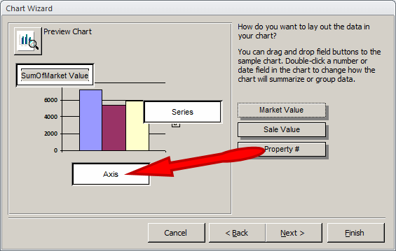
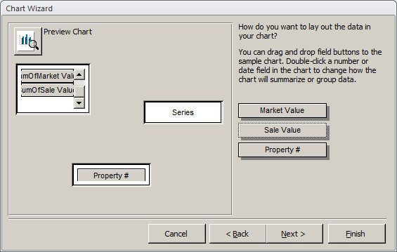
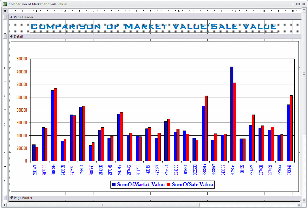
Another variance of the column chart is to show two columns for each sample value. For example, in our real estate application, imagine that you have the market value for each property and the value the property was sold for, one of the effects of a sale is that some properties would be sold for the same market value, some properties would be sold for a lower value (for example, the seller may want to get rid of the house and be willing to assist the buyer with a down payment and closing cost, thus lowering the price of the house), some other properties could be sold higher than the advertised value (for example, a customer may want to insist on having the house, even at a high price, or too many people could be suddenly interested in the same house, this could raise the price). At the end of the year, when doing an inventory or an evaluation of some sort, you may want to know what houses sold high and which ones sold low.
![]() Practical
Learning: Varying a Column Chart
Practical
Learning: Varying a Column Chart
|
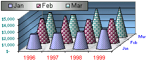
3-D Column Charts |
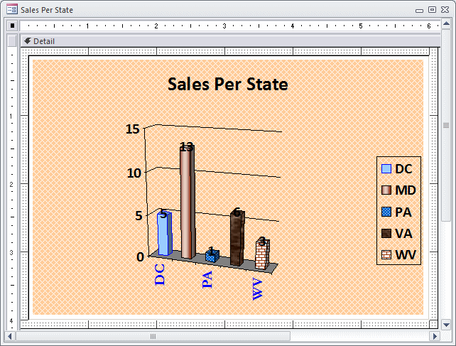
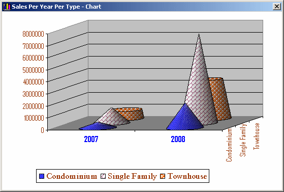
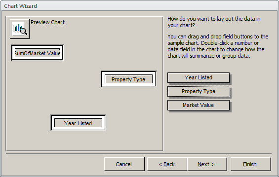
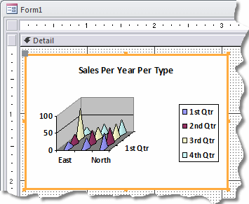
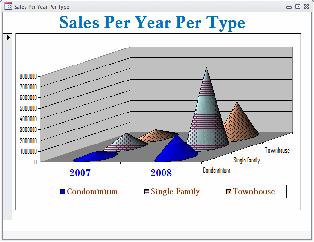
So far, we have used what are referred to as flat charts. They can be drawn on a 2-dimensional coordinate system (x, y). To enhance the appearance of a chart, you can draw it in 3-dimensional coordinate system (x, y, z). If you want to draw a 3-D chart, you must select three columns. Two of the columns should hold categories of values and the other one can hold unique values. The two columns that hold categories of values should have corresponding values so that, a value from one column can have corresponding values in the second column. Here is an example. Imagine that, in a real estate database, you have been selling properties over a period of 1, 2, 3 or more years. The properties sold are categorized as single families, townhouses, and condominiums. Obviously in a particular year, you sell properties of all kinds. On the other hand, each property can have its own value. You can use these three sets of values to create a 3-D chart.
|
The cone, cylinder, and pyramid charts can be used in the same scenario as the column chart. Their 3-D visual effect can enhance the overall analysis of data. The cylinder chart creates long circular boxes of the same base on both ends. It can be enhanced with good formatted Fill Effects. This chart is suitable for industry, manufacturing analysis, and predictions. |
 |
The cone chart is made of a circular base topped by a higher point. When used with various data, the higher value will have the complete cone while the lower values will share portions of the geometric figure. The cone chart should be used with values that can take advantage of its graphing dimensions.
The pyramid chart resembles the cone chart with a difference on their respective bases. Both are constructed the same and can be used in similar scenarios.
When creating the chart, there are many aspects you can change for it. For example, you may have a chart where the figures in the front seem to hide those in the back:
Or there is too much room on one side. You can rotate the chart. To do this, click one of the borders of the walls of the chart to select its frame. Then click one of the handles on the frame and hold the mouse down. The actual frame of the chart would appear:
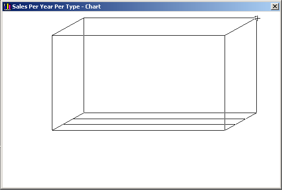
You can then rotate the chart in the direction of your choice. You can keep doing this, releasing the mouse to preview, then rotating again, until you get the desired orientation.
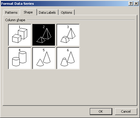
If you created the chart as one shape (cylinder, cone, or pyramid) but want to use another shape, you can change it. To do this, in Microsoft Graph, right-click the chart and click Format Data Series. In the Format Data Series dialog box, click the Shape tab and select a different shape:
![]() Practical
Learning: Creating a 3-D Chart
Practical
Learning: Creating a 3-D Chart
As done for the column chart, when specifying the values of a bar chart, use a column that has frequent occurrences of the same values. Types of Charts: Line Charts |
||||
|
Introduction |
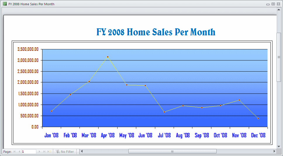
A line chart is used to analyze ups and downs of a tendency in a range of values. You can define it with one series of values where you will judge the evolution of an item over a period. When used with more than one series, this chart can be helpful in comparing values of the same category over the same period. The line chart can also be used to analyze values that do not share the same periodic variable. For example, you can use it to compare library attendance with regards to the real population number (which could be in hundreds of thousands or millions) with the number of people attending the library. In the latter situation, if the same axes are used to analyze, one category will almost disappear from the chart; the alternative is to separate the axes on the same chart.
![]() Practical
Learning: Creating a Line Chart
Practical
Learning: Creating a Line Chart
|
Trend Lines |
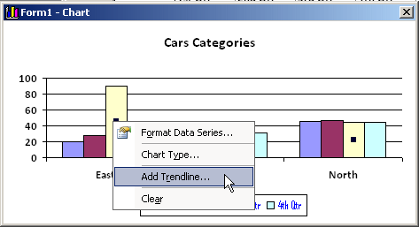
A trend line is a line added to a chart created as a column or else. It can be used to show the high points of the various values on a chart. A trend line is not a type of chart. It is only a line added to an existing chart to accentuate its tendencies.
To add a trend line to a chart, after opening Microsoft Graph, right-click one of the column categories and click Add Trendline...
This would open the Add Trendline dialog box. In the Type property page, you can select the type of line you want:
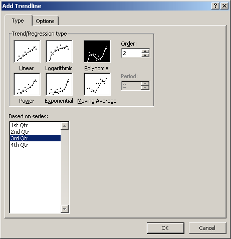
If your chart is using more than one category, you can select each in the Based On Series list box and specify its trend line. The Options property page allows you to specify more options. Once you have finished, click OK:
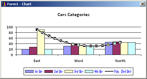
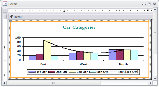
After creating a trend line, you can change its characteristics. To do this, right-click the trend line and click Format Trendline... This would open the Format Trendline dialog box that you can use for various reasons, including specifying the color of the line. You can also access its Type and its Options property pages and change the original settings. Once you click OK and close Microsoft Graph, the trend line or its new changes would apply to the chart:
In the same way, you can add a trend line for each category of the column or bar chart.
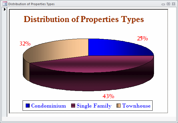
Types of Charts: Pie Charts
|
Introduction |
 |
A pie chart is used to show percentage and/or fractional values. When creating it, you can choose the values as you see fit. Microsoft Graph would identify each value in the column and create categories for them. After getting the categories, the application would calculate the percentage for each category based on the sum of all the values, the total count of categories, and the fraction that each category shares. The default appearance of a pie chart is a circle with each category taking a pie in the whole. One of the variances of the chart displays in three dimensions that uses two ellipses. The top ellipse is the most visible and shows the format of each chart. Only part of the bottom ellipse is shown. |
![]() Practical
Learning: Creating a Pie Chart
Practical
Learning: Creating a Pie Chart
|
Doughnut Charts |
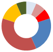 |
A Doughnut chart is an alternative to the Pie chart as both use the same types of values. The main difference between both types of charts is that a Doughnut chart can include more than one series of values. |
Lesson Summary
|
MCAS: Using Microsoft Office Access 2007 Topics |
| P3 | Create and modify charts |
|
Exercises |
Yugo National Bank
US Senate