Introduction to Windows Controls
|
|
Introduction to Windows Controls |
The Win32 library defines a window as a rectangle object that displays on the screen. In order to give presence to such an object, its window must be explicitly created. There are two main categories of windows you will need to create for your application: parents and children: |
A child window can be a parent of another control. For example, the Standard toolbar of C++ Builder is the parent of the buttons on it. If you close or hide the toolbar, its children disappear. At the same time, the toolbar is a child of the application's frame. If you close the application, the toolbar disappears, along with its own children. In this example, the toolbar is a child of the frame but is a parent to its buttons.
As seen in the previous lesson, there are two main techniques of making a control available to an application: The control can be visually added from the Component Palette or it can be programmatically created. To create a control using the Win32 approach, you can call either the CreateWindow() or the CreateWindowEx() function.
If for any reason you cannot or would not visually add a control at design time, you can create it programmatically. There are various techniques you can use. You can first decide what class will be used as the basis of your control. Once you have the object you want to use, declare a pointer to its class using the new operator. When dynamically creating a control, you must specify its owner. The owner will be responsible hosting or carrying the child control. The name of the owner is passed to the constructor of the control. This would appear as follows: //---------------------------------------------------------------------------
void __fastcall TForm1::FormCreate(TObject *Sender)
{
TSomeControl *ctlShowMe = new TSomeControl (Mom);
}
//---------------------------------------------------------------------------
After specifying the owner, you must also specify the parent of the control. The parent is responsible for destroying the child control when it (the parent) is destroyed. To specify the parent of a control, call its Parent property and assign it the name of the parent. Normally, the name of the parent is the same as the owner. This would be done as follows: //---------------------------------------------------------------------------
void __fastcall TForm1::FormCreate(TObject *Sender)
{
TSomeControl * ctlShowMe = new TSomeControl (Mom);
ctlShowMe->Parent = Mom;
}
//---------------------------------------------------------------------------
If you declare and completely create a control in an event or a method, the control would be available only in that member function and cannot be accessed outside. To make such a control available to other events or controls owned by the same parent, you should declare it in the private section of its parent. Here is an example: //---------------------------------------------------------------------------
class TForm1 : public TForm
{
__published: // IDE-managed Components
private:
TSomeControl * ctlShowMe; // User declarations
public: // User declarations
__fastcall TForm1(TComponent* Owner);
};
//---------------------------------------------------------------------------
After declaring the control, you can sepecify its parent and owner in the constructor of the form as follows: //---------------------------------------------------------------------------
__fastcall TForm1::TForm1(TComponent* Owner)
: TForm(Owner)
{
ctlShowMe = new TSomeControl(Mom);
ctlShowMe->Parent = Mom;
}
//---------------------------------------------------------------------------
If you are using a VCL control, you must know the name of the class on which the control is based (and each control is based on a particular class). If you have examined the types of classes available but none implements the behavior you need, you can first locate one that is close to the behavior you need, then use it as a base to derive a new class. To derive a class from an existing VCL control, you must at least declare a constructor that will specify the owner of the control. An example would be: //---------------------------------------------------------------------------
class TPlatform : public TPanel
{
public:
__fastcall TPlatform(TComponent *Owner);
};
//---------------------------------------------------------------------------
Besides the constructor, in your class, add the properties, methods, and/or events as you see fit. When implementing the constructor, specify the owner as the base class. You can also use it to globally set a value for a property of the base class. Here is an example: //---------------------------------------------------------------------------
__fastcall TPlatform::TPlatform(TComponent *Owner)
: TPanel(Owner)
{
Color = clBlue;
}
//---------------------------------------------------------------------------
Once the control is ready, you can dynamically create it like any other VCL control. If you want to use a fresh class based on a Win32 control, you can create your own class and either derive it from an existing Win32 object or overloaded the Win32 class that would be used as base (for example, you can overload the HWND handle).
There are three main categories of controls we will use in this book: existing VCL controls, existing Win32 controls, and custom controls that are not inherently available from the other categories. We will always prefer VCL controls because that is the subject of this book. If a control cannot do what we want, which will hardly happen, then we can use one of the Win32’s. In extreme cases, we may have to create a new control. Once again, to create a Win32 control, you can use either the CreateWindow() of the CreateWindowEx() function. They are defined as follows:
A handle is a numeric value used internally by Microsoft Windows to identify a control or a class. Every control must have a handle. You have a choice of using it or not but the compiler uses it. As you can see, the Win32 library defines a window as a handle to a window object, known as HWND. After the window has been created, the CreateWindow() or the CreateWindowEx() function returns an HWND variable. You can use this return value later on to access the created window, for example to change some of its characteristics. To access the handle the handle to a control, when creating it, make sure you return its HWND value. This would be done as follows: //---------------------------------------------------------------------------
void __fastcall TForm1::FormCreate(TObject *Sender)
{
HWND hWndButton = CreateWindow( . . . );
}
//---------------------------------------------------------------------------
Once you have the return value of a control, you can call that value any way you see fit in your program. When creating a VCL application, you will mostly use the properties, methods, and events defined by that library. Because the VCL implements Windows controls through a class called TWinControl, it makes sure it provides you with an HWND handle that allows you to directly access the properties or messages of the control as defined in the Win32 library. The handle to a Windows control is (simply) called Handle.
To create a control, the primary piece of information you must provide is its name. This allows you and the compiler to know what control you are referring to when the program is running. Specifying the name of a control may depend on the technique you decide to use to create the control. After adding a control to a form, it automatically receives a name. In the Object Inspector, the control’s name displays in the Name field. The newly added control reflects the name of its button on the Component Palette and adds an incremental number. For example, if you click the Edit button on the Component Palette and click the form, the control would be named Edit1. If you add a second Edit control, it would be named Edit2. This causes the default names to be incremental. Since a program usually consists of many controls, it is usually a good idea to rename your controls and give them meaningful and friendlier names. The name should help you identify what the button is used for. To change the name of a control, on the Object Inspector, click the word Name and type a valid C++ name (following the rules of C++ identifiers). If you are using the Win32’s CreateWindow() or CreateWindowEx() function, you can either use one of the existing names of controls or you are create a control that a custom name. The Win32 library provides already defined names of classes you can use to create a control. The Standard controls use the following class names:
Microsoft Windows added a few more class names for objects referred to as Common controls. Fortunately, whether you want to use standard or common controls, the VCL provide friendlier implementations of all of them with even more Windows control than the Win32 provides. To use one of the Win32 classes, pass its name as string to the lpszClassName argument of the CreateWindow() or the CreateWindowEx() functions. Here is an example that would start an edit box: //---------------------------------------------------------------------------
void __fastcall TForm1::FormCreate(TObject *Sender)
{
CreateWindow("EDIT", );
}
//---------------------------------------------------------------------------
Whether you are using the VCL or the Win32 libraries, although you can change the name of a control at runtime, refrain from doing it.
Some controls, as we will see, are text-based, meaning they are meant to display or sometimes request text from the user. For such controls, this text is referred to as caption while it is simply called text for some other controls. This property is not available for all controls. If a control displays text, it then has a Caption or a Text property in the Object Inspector. After adding such a control to a form, its Caption or its Text field would hold the same text as its name. At design time, to change the text of the control, click either its Caption or its Text field and type the desired value. For most controls, there are no strict rules to follow for this text. Therefore, it is your responsibility to type the right value. The text provided in a Caption or Text fields of a text-based control can only be set “as is” during design. If you want the text to change while the application is running, you can format it. For example, such a control can display the current time or the name of the user who is logged in. These format attributes cannot be set at deign time. To change the text of a text-based control at run time, either assign a simple string or provide a formatted string to either the Caption or the Text property. Here are two examples: //---------------------------------------------------------------------------
void __fastcall TForm1::FormCreate(TObject *Sender)
{
Panel1->Caption = "Let it Go";
Edit1->Text = Time();
}
//---------------------------------------------------------------------------
As we will see when studying messages and events, you can also change the text of a control using the SendMessage() function with the message set as WM_SETTEXT. If you are using the Win32 approach, the text of a text-based control is passed as the lpWindowName argument of the CreateWindow() or the CreateWindowEx() functions: //---------------------------------------------------------------------------
void __fastcall TForm1::FormCreate(TObject *Sender)
{
CreateWindow("Button", "Submit", );
}
//---------------------------------------------------------------------------
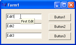
A tool tip is a small yellowish box that displays on a control when the user rests the mouse on such an object for a few seconds. A tool tip is a form of help that allows the user to get a quick and brief characteristic about the control. In VCL applications, a tool tip is called a Hint. Hints in VCL applications can be applied on different levels, on all controls or on just some of them. A hint can be made of just the text that displays when the user rests the mouse on a control. A hint can also be made of two parts: the text that displays as a tool tip on the control and a little longer text on the status bar. Every visual control that displays when a form is running has a property called Hint. This property can hold text that would display as the control's tool tip. To display a hint on a control, the first thing you should do is to set the ShowHint property of the control to true. The ShowHint property controls whether its control would display a hint or not. Once the ShowHint property has a true value, you can specify the necessary text on the Hint property. Here is an example:
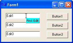
As seen on this picture, the background color of hint appears yellow. If you want a different color, assign a TColor value of your choice to the global TApplication::HintColor variable. When doing this, remember to select a color that would still make the text readable. Here is an example:
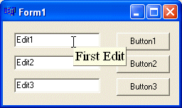
The hint displays its word or sentence using a default global font set on the operating system. If you want to choose the font that should be used when displaying the hints, call the TScreen::HintFont property and define the font of your choice. Like a TApplication object, a TScreen variable is already available when you create a form. Here is an example:
The Hint can also hold two strings: one that would display both as a tool tip and one that would display on the status bar. You can create text on the Hint property using the following syntax: The Hint | Status Bar Text This string is made of two actual strings separated by a bar. The string on the left side of the bar is the text that would display on the control when the mouse rests on it for a few seconds. The bar and the second string are optional. If you omit the bar and the right string, the unique string would be used as the hint and the status bar text. The ShowHint property of each control is used to manage hints for that control only. If you use this approach, you would have to set the ShowHint of each control, whose hint you want to provide, to true. If you plan to use hints on many, most, or all controls of a form, the parent form provides a property. If you set the ShowHint property of the form to true, the ShowHint property of all controls on the form would be automatically set to true. In that case, you would not have to set the ShowHint property for each control. In fact, if you plan to use hints for various controls of your form, set the ShowHint of the form to true, unless you have a good reason why you do not need to. The hints of a VCL application are globally controlled by the Hint member variable of the TApplication class. Whenever you create an application, a variable called Application is declared and can take care of such assignments that pertain to the application as a whole. To actually show hints on your controls, you must define a global function that is passed a TObject argument. The name of the function is not important. In the body of the function, assign the Hint member of the global Application variable to the desired panel of your status bar. After defining this function, in the OnCreate event of the form, assign the name of the previously defined function to the OnHint member variable of the global Application variable.
A style is a characteristic that defines the appearance, and can set the behavior, of a control. The styles are varied from one control to another although they share some of the characteristics common to most Windows controls. //---------------------------------------------------------------------------
void __fastcall TForm1::FormCreate(TObject *Sender)
{
CreateWindow("Button", "Submit", WS_CHILD, );
}
//---------------------------------------------------------------------------
If you have a good reason to do so, you can change the parent of a child control at run time. To do that, simply assign the name of a different control to the object whose parent you want to change. The designated parent must be a type of control that can be a parent since some controls can act as a parent and some cannot. Alternatively, to change the parent of a control, you can call the SetParent() function. Its syntax is: HWND SetParent(HWND hWndChild, HWND hWndNewParent);
The hWndChild argument must be a handle to the control whose parent you want to change. The
hWndNewParent argument must be the handle of the new parent. //---------------------------------------------------------------------------
void __fastcall TForm1::Button1Click(TObject *Sender)
{
TWinControl *Poppy = Button2->Parent;
if( Poppy == this )
ShowMessage("The form is your daddy");
}
//---------------------------------------------------------------------------
Alternatively, to find out what object acts as a control’s parent, call the Win32 API’s GetParent() function. Its syntax is: HWND GetParent(HWND hWnd);
The hWnd argument must be a handle to the control whose parent you want to find out. //---------------------------------------------------------------------------
void __fastcall TForm1::Button1Click(TObject *Sender)
{
HWND Poppy = GetParent(Button2->Handle);
if( Poppy == this->Handle )
ShowMessage("The form is your daddy");
}
//---------------------------------------------------------------------------
A control is referred to as visible if it can be visually located on the screen. A user can use a control only if he or she can see it. As a programmer, you have the role of deciding whether a control must be seen or not and when. //---------------------------------------------------------------------------
void __fastcall TForm1::Button1Click(TObject *Sender)
{
if( Panel1->Showing )
Panel1->Visible = False;
}
//---------------------------------------------------------------------------
While the Visible property can be read or changed, Showing is a read-only property. This means that you can assign a true or false value to Visible but you can only check the state of Showing; you cannot change it. The following code will not compile: //---------------------------------------------------------------------------
void __fastcall TForm1::Button1Click(TObject *Sender)
{
// This will not work because you cannot change Showing
if( Panel1->Showing )
Panel1->Showing = False;
}
//---------------------------------------------------------------------------
//---------------------------------------------------------------------------
void __fastcall TForm1::ToggleControlAppearance()
{
	Form2->Visible = !Form2->Visible;
}
//---------------------------------------------------------------------------
To made a control visible when using either the CreateWindow() or the CreateWindowEx() functions, add the WS_VISIBLE style to its dwStyle argument. Some controls cannot be seen by the user. Examples are object from the Dialogs tab of the Component Palette and some other controls such as the image list. These controls do not have a Visible field in the Object Inspector.
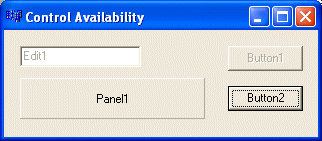
For the user to use a control, it must allow it. For example, if a control is supposed to receive text, the user can enter characters in it only if this is made possible. To make a control available to the user, the object must be enabled. By default, after adding a control to a form, it is enabled and its Enabled property in the Object Inspector is set to true. An enabled control displays its text or other characteristics in their normal settings. If you want to disable a control, set its Enabled property to false. In the following picture, the two top controls (the edit box and the button) are disabled:
To find out whether a control is enabled or not, check its Enabled property state. By default, a newly created control using the CreateWindow() or the CreateWindowEx() functions is enabled. If you want to disable it, add the WS_DISABLED style to its dwStyle argument.
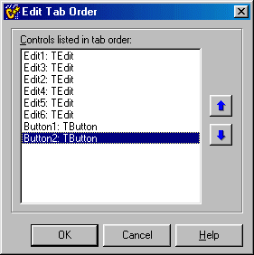
As we saw with control design, a user can navigate through controls using the Tab key. When that key has been pressed, the focus moves from one control to the next. By their designs, not all controls can receive focus and not all controls can participate in tab navigation. Even controls that can receive focus must be explicitly included in the tab sequence.
Alternatively, at design time, you can click a control on the form. Then, on the object Inspector, change the value of its TabOrder field. The value must be a positive short integer. If you are creating the control using either the CreateWindow() or the CreateWindowEx() functions, to include it in a tab sequence, add the WS_TABSTOP style.
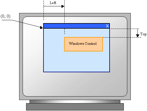
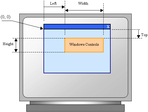
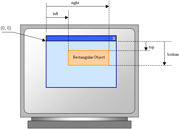
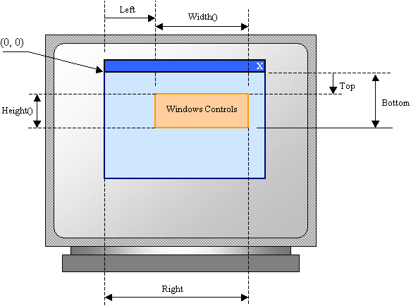
The controls added to a parent window are confined to the area of the body offered by that window. After adding it to a window, the control is positioned in the body of the parent using a Cartesian coordinate system whose origin is located on the top-left corner of the parent window. The horizontal measurements move from the origin to the right. The vertical measurements move from the origin to the bottom. The distance from the control’s left border to the parent’s left border is called the Left property. The distance from the control’s top border to the parent’s top border is called the Top property. The Left and Top values are known as the control’s location. This can be illustrated as follows:
When you click a control on the Component Palette and click its parent window, the Left and Top values are set where the mouse landed. To change the location of a control, as we saw in the previous lesson, you can click and drag it to the new desired location. Alternatively, you can type the desired value in either the Left or the Top fields on the Object Inspector. At design time, if you drag a control to move it, C++ Builder updates the values of its location. If you save the project, the compiler would also save the locations of all objects, including the form, so that the next time you run the application, the compiler would remember to display the form where it was last positioned at design time. To programmatically move a control, which is equivalent to changing the values of the Left or the Top properties at run time, assign the desired respective values. If you set a negative value for the Left field, the left border of the control would be hidden. In the same way, a negative Top value would hide the top border of the control. Make sure you use valid integer values; otherwise you would receive an error when you compile the project. If you are using the CreateWindow() or the CreateWindowEx() functions, to set the left distance, pass the desired value as the X argument. On the other hand, to specify the top distance, pass the desired value for the Y argument.
The distance from the left border to the right border of a control is referred to as its Width property. In the same way, the distance from the top to the bottom borders of a control is its Height value. This can be illustrated as follows:
If you click a control’s button on the Component Palette and click its parent window, the control assumes some default dimensions in the body of the parent. As we saw in the previous lesson, to change the dimensions of a control, you can drag one of its borders or corners. Alternatively, on the Object Inspector, you can type the desired values in either or both the Height and the Width fields. If the control has already been created, you can resize it at run time. To change the dimensions programmatically, simply assign the desired value to the Height and/or Width property of your choice. Here is an example that changes the width of the form: //---------------------------------------------------------------------------
void __fastcall TForm1::ChangingFormWidth()
{
Width = 248;
}
//---------------------------------------------------------------------------
If the value you give to a property is not allowed, the program would throw an error. //---------------------------------------------------------------------------
void __fastcall TForm1::FormCreate(TObject *Sender)
{
HWND hWndButton = CreateWindow( "Button", "Submit",
WS_CHILD | WS_VISIBLE | WS_TABSTOP,
10, 10, 124, 25, );
}
//---------------------------------------------------------------------------
If you specify negative values for the left and top distances, either the left or the top borders, respectively, will be hidden.
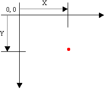
Because a control’s location can be identified with two values, it can also be illustrated as a geometric point on the coordinate system of the screen. A point is a pixel on the monitor screen, on a form, or on any object of your application. A point is represented by its coordinates with regard to the object that "owns" the point:
To identify the concept of a point, the Win32 library provides the POINT structure. This structure is defined as follows: typedef struct tagPOINT {
LONG x;
LONG y;
} POINT, *PPOINT;
The first member, x, represents the horizontal distance of the point from the top-left corner of the object that owns the point. The y member represents the vertical measurement of the point with regards to the top-left corner of the object that owns the point. Besides the Win32's POINT structure, the VCL provides a class that performs the same operations with a more appropriate conception of a C++ class. It is called TPoint. While Win32 is written in C and most of its objects are pure structures in the C sense, the VCL's TPoint is a true and complete C++ class. It is defined as follows: struct TPoint
{
TPoint() {}
TPoint(int _x, int _y) : x(_x), y(_y) {}
TPoint(POINT& pt)
{
x = pt.x;
y = pt.y;
}
operator POINT() const
{
POINT pt;
pt.x = x;
pt.y = y;
return pt;
}
int x;
int y;
};
As you can see, you can define or retrieve the position of a TPoint variable using its x and y values. Because it has a constructor, you can also declare it as a C++ variable. To represent the size of an object, the Win32 library provides the SIZE structure defined as follows: typedef struct tagSIZE {
LONG cx;
LONG cy;
} SIZE, *PSIZE;
The cx member variable is usually used as the distance from the left to the right borders of a control. The cy member variable usually represents the distance from the top to the bottom borders of the control. struct tagSIZE
{
long cx;
long cy;
} typedef tagSIZE TSize;
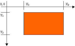
The member variables of the TSize structure represent the width as cx and the height as cy of an object. As seen so far, a control is a rectangular object that can be located, and whose dimensions are visible, on the screen. A rectangle is a geometric figure that has four sides (for this reason, it is called a quadrilateral figure). It is known for its horizontal and its vertical measures. The horizontal measure of a rectangle is referred to as its length and sometimes its width. The vertical measure is known as its height. In fact, on a Cartesian coordinate, a rectangle is represented by its four corners (x1, y1, x2, y2) as illustrated on the left figure below:
We saw already that each object of your application, including a form, is visually defined by its location and its dimensions on the screen for a form or on the object that owns it. These two aspects are controlled by a geometric rectangle that defines the location and the dimensions of the object. In Win32, from the above right rectangle, the syntax of the RECT structure is defined as follows: typedef struct _RECT {
LONG left;
LONG top;
LONG right;
LONG bottom;
} RECT, *PRECT;
The RECT structure can be illustrated as follows:
Notice that the left and the top measures are the same as the Left and the Top values of a control but the right and the bottom values are not the width and the height of a control. This is not an anomaly. It was done like that on purpose. You can use the Win32 RECT structure wherever you need to define a rectangle in your VCL applications. Besides the RECT structure, the VCL provides its own class to represent a rectangle. It is called TRect and it is defined as follows: struct TRect
{
TRect() {}
TRect(const TPoint& TL, const TPoint& BR) { left=TL.x; top=TL.y;
right=BR.x; bottom=BR.y; }
TRect(int l, int t, int r, int b) { left=l; top=t; right=r; bottom=b; }
TRect(RECT& r)
{
left = r.left;
top = r.top;
right = r.right;
bottom = r.bottom;
}
int Width () const { return right - left; }
int Height() const { return bottom - top ; }
bool operator ==(const TRect& rc) const
{
return left == rc.left && top==rc.top &&
right == rc.right && bottom==rc.bottom;
}
bool operator !=(const TRect& rc) const { return !(rc==*this); }
__property LONG Left = { read=left, write=left };
__property LONG Top = { read=top, write=top };
__property LONG Right = { read=right, write=right };
__property LONG Bottom = { read=bottom, write=bottom };
};
The TRect class can be illustrated as follows:
It is important to notice that, to conform to the RECT structure, the TRect class provides two constructors: TRect(int l, int t, int, r, int b) and TRect(RECT& r). The first is used to simply reproduce the member variables of the RECT structure and the second is used to create a copy of RECT. Once these two constructors have been defined making the RECT member variables available, the class declares two new methods. The Width() member function returns the distance from the left to the right borders of the rectangle. The Height() method performs the equivalent calculation vertically. One of the ways you can use the TRect class consists of declaring a rectangle using its default constructor and then specifying a value for each on of its members. Here is an example: //---------------------------------------------------------------------------
__fastcall TForm1::TForm1(TComponent* Owner)
: TForm(Owner)
{
TRect Recto = TRect;
Recto.Top = 100;
Recto.Left = 120;
Recto.Right = 420;
Recto.Bottom = 288;
}
//---------------------------------------------------------------------------
If you do not know or cannot get the right and the bottom measures of the rectangle but know its width and its height, you can still use them to declare and initialize a rectangle. The TRect class provides one more alternative you can use to declare a rectangle. Suppose you have the coordinates of the top-left and the bottom-right borders of the rectangle, you can declare and initialize it. The constructor you would use is: TRect(TPoint TopLeft, TPoint BottomRight); Using the concept of a screen defined rectangle, a control is included in a rectangle known as the BoundsRect property. Therefore, at any time, to get the location and the dimensions of a control, call its BoundsRect property, which produces a TRect value. Here is the final code of the Win32 control we were creating: //---------------------------------------------------------------------------
void __fastcall TForm1::FormCreate(TObject *Sender)
{
CreateWindow("Button", "Submit",
WS_CHILD | WS_VISIBLE | WS_TABSTOP,
10, 10, 124, 25,
Handle, NULL, HInstance, NULL);
}
//---------------------------------------------------------------------------
Alternatively, to get the location and dimension of a control, you can call the GetWindowRect() function. Its syntax is: BOOL GetWindowRect(HWND hWnd, LPRECT lpRect); This function returns a rectangle that holds the location and the dimensions of the control as, lpRect.
As in C++, a method is a function created as a member of a class. Methods are used to access or manipulate the characteristics of an object, a variable, or a pointer to a class. There are mainly two categories of methods you will use in your classes:
The methods of a class are available only at run time. Except for the constructor, to access a method, first make sure you have the variable or pointer. Then use either the period operator for a variable or the arrow operator for a pointer to access the desired method. The most fundamental and the most common method of a class is its constructor. As all Windows controls of the VCL are based each on a particular class, each one of them has at least one constructor. Dynamically creating a control consists of declaring a pointer to its class using the new operator. If the control is a visual object, you must specify its parent, as we will see. This is done by calling its main constructor. If the class does not represent a visual object, call its default constructor. The second most popular method is the destructor. Based on the rules of RAD programming, you will never need to call the destructor of a control or a class, even if you dynamically create the variable. If you need to destroy an object that was programmatically created, you will use the delete operator.
We saw that, in order to use a control, it must be visible. The visibility of a control can be made by setting its Visible property to true. Alternatively, to display a window, you can call the TControl::Show() method. Its syntax is: void __fastcall Show(); If the control is visible, nothing would happen. If it were hidden, then it would be revealed. Here is an example: //---------------------------------------------------------------------------
void __fastcall TForm1::Button1Click(TObject *Sender)
{
Panel1->Show();
}
//---------------------------------------------------------------------------
The Show() method internally sets the Visible property to true. Alternatively, to show a window, you can call the ShowWindow() function. Here is an example: //---------------------------------------------------------------------------
void __fastcall TForm1::Button1Click(TObject *Sender)
{
ShowWindow(Panel1->Handle, SW_NORMAL);
}
//---------------------------------------------------------------------------
On the other hand, we saw that, to hide a control, you can set its Visible property to false. In the same way, to hide a control, you call can the TControl::Hide() method. Its syntax is: void __fastcall Hide(); Keep in mind that hiding a control does not close or destroy it.
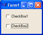
The focus is a visual aspect that indicates that a control is ready to receive input from the user. Various controls have different ways of expressing that they have received focus.
|
| Buttons controls indicate that they have focus by drawing a dotted rectangle around their caption. Here are examples: | 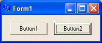 |
 |
Here is another example of a button-based control whose caption is surrounded with a dotted line. |
| A text-based control indicates that it has focus by displaying a blinking cursor: | 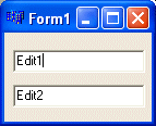 |
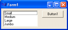 |
A list-based control indicates that it has focus when one of its items has a surrounding dotted rectangle. |
|
To give focus to a control, the user can click it or press a key. To programmatically give focus to a control, call the TWinControl::SetFocus() method. Its syntax is: |
void __fastcall SetFocus();
| Home | Copyright © 2005-2016, FunctionX | |