To make your application as efficient as possible, you will add controls to a dialog box when you judge it necessary. Some and most controls are already available so you can simply customize their behavior and appearance. Sometimes you will need a control for a specific task or for a better look. If such a control is not available, you may have to create your own. There are two main ways a control is made part of your application. At design time, which is the time you are visually creating an application, you will select controls and place them on a dialog box. Another technique, referred to as run time, consists of creating a control programmatically. In this case you must write all the code that specifies the control's appearance and behavior.
There are two types of windows or controls you will deal with in your applications. The type referred to here is defined by the relationship a window has with regards to other windows that are part of an application:
When a parent is created, made active, or made visible, it gives existence and visibility to its children. When a parent gets hidden, it also hides its children. If a parent moves, it moves with its children. The children keep their positions and dimensions inside the parent. When a parent is destroyed, it also destroys its children (sometimes it does not happen so smoothly; a parent may make a child unavailable but the memory space the child was occupying after the parent has been destroyed may still be in use, sometimes filled with garbage, but such memory may not be available to other applications until you explicitly recover it). Child controls depend on a parent because the parent "carries", "holds", or hosts them. All of the Windows controls you will use in your applications are child controls. A child window can also be a parent of another control. For example, the Standard toolbar of Microsoft Visual Studio is the parent of the buttons on it. If you close or hide the toolbar, its children disappear. At the same time, the toolbar is a child of the application's frame. If you close the application, the toolbar disappears, along with its own children. In this example, the toolbar is a child of the application but is a parent to its buttons.
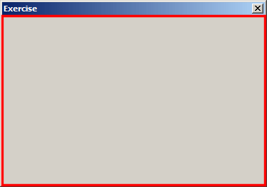
To use an object in your application, you must provide it with "physical"� presence. If you add the control visually, it assumes the position where you place it. If you are programmatically creating the control, you must know how much space its parent window is making available to its children before even deciding about its location and dimensions. To provide its parental support to the child controls, the parent window allocates an amount of space in a rectangular shape called the client area:
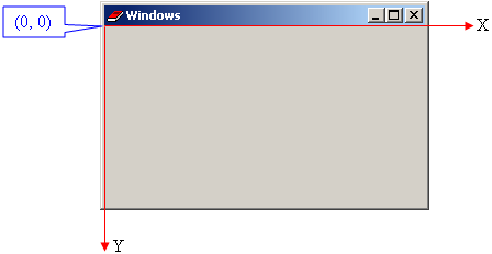
The objects you add are confined to the client area offered by the parent window. After visually adding an object to a parent, it assumes a location and takes some dimensions in this area. The origin of the rectangular client area is on the upper-left corner of the parent window. The horizontal measurements move from the origin to the right. The vertical measurements move from the origin to the bottom:
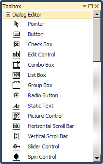
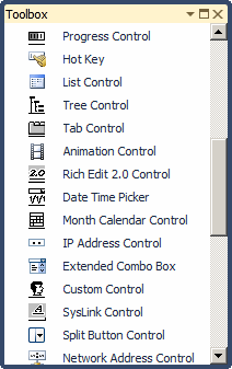
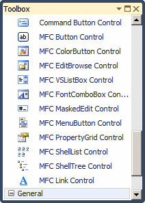
The controls used to provide functionality to your application are provided by the Toolbox window. By default, the Toolbox is positioned to the left of Microsoft Visual Studio as a long vertical window. By default, the Toolbox shows each control as a row with an icon on the left and the name of the control on the right side::
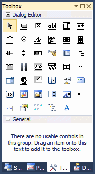
If you don't need the explicit name, you can make the Toolbox display only the icons. To do that, right-click any section of the Toolbox and click List View to remove the check box on it:
As mentioned already, by default, the Toolbox is position to the left. If you want, you can move it. To do that, click and drag its title bar away from it current position. The Toolbox presents a certain number of records. More objects, called ActiveX controls, can be accessed and added to the Toolbox but such additional objects are made available only to the current application. The first icon in the Toolbox is named Pointer. This is not a control, it allows you do deselect.
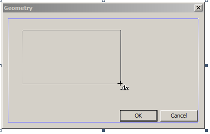
To assist you with dialog and controls design, you can use the Dialog Editor. It is a dialog box equipped with various buttons:
To get the Dialog Editor:
To add one of the controls in your application, you can click it and click a host. You can keep adding controls on the dialog box when necessary. If you want to add a control over and over again, press and hold Ctrl. Then click the control in the Toolbox and release Ctrl. Then click the desired area on the dialog box. Every time you click, the control would be added to the dialog box. Once you have added enough controls, to dismiss it:
You cannot select more than one control to add on a host. Another technique you can use to visually add a control is to "design" it. To do this, after clicking the control from the Toolbox, you can click and hold the mouse on the parent window, then drag left, up, right, or down. While you are dragging, you can refer to the right section of the status bar for the current location and dimensions of the control:
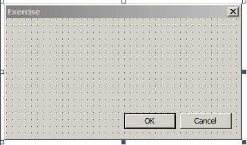
To help you position the controls you are adding at design time, you can display some guiding grid dots. To do this:
After you have allowed the grids, the controls can be positioned and resized anywhere in the area inside the borders of the parent window, using the grids as guides:
When you click the body of the parent, the top-left corner of the control would be positioned on a dot and the dimensions (width and height) of the control would align with the next dots on its right and bottom. To avoid this default behavior, before clicking the body of the parent, press and hold Alt; then click and drag to draw a rectangle shape of the control. The location would be where you clicked, even if you clicked between two dots. The dimensions would stop where you released the mouse, even it if was between two dots. After placing a control on a parent window that displays grids, the borders of the child control can only be aligned with the black dots. The grids are separated using a measure called the Dialog Box Unit or DLU. By default, two vertically aligned dots are separated by a height of 6 DLUs. Two horizontally aligned dots are separated by a width of 6 DLUs. If these measures don't fit you, there are two options you can use:
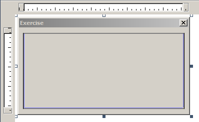
You can position the controls without using grids. If you do not want to use the grids, you can hide them. To do this, display the Guide Settings dialog box and click either None or Rulers and Guides. To restrict the area available for controls in the click area of the parent, a dialog box can be equipped with a dotted box. To show it, display the Guide Settings dialog box and click Rulers and Guides:
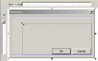
In the Rulers and Guides view, the studio displays a horizontal ruler above the dialog box and a vertical ruler to the left. It also displays a blue rectangular box on the dialog box. This (blue dotted) rectangle allows you to effectively control the area available to your controls. To set the location and dimensions of the available area, click one of the (blue dotted) rectangle borders or corners and drag in the desired direction. You can click and drag a border or a corner of the dotted rectangle to change the area available to child controls:
After setting the (blue dotted) rectangular location and area, you can add but cannot move a control outside of that (blue dotted) rectangle. The idea is to allow you to design a control or a group of controls in a confined area. The (blue dotted) rectangle provides an effective means of aligning controls. After using it, if you want to add and manipulate controls outside of it, you should display the grids.
To visually manipulate a control, you will first need to select it. To select a control, simply click it. A control that is selected is surrounded with 8 (blue) small squares:
To select more than one control in the same area, click on the dialog box and draw a "fake" rectangle that encloses all of the needed controls. The first control from the selected group has 8 (blue) handles while the other control(s) from the same selected group has (have) 8 white handles (each). To select controls at random, click one of them. Press and hold either Shift or Ctrl. Then click each one of the needed controls.
After adding a control to a dialog box, it assumes either its default size or the size you drew it with. To change the size of a control, first select it. Then position the mouse on one of its handles. The mouse would assume a sizing cursor that indicates the possible type of resizing you can apply. The mouse cursors are:
To resize a control, that is, to give it a particular width or height, position the mouse on one of the handles and drag in the desired direction. If the dialog box is showing the grid indicators, a control can be moved or resized only on the dotted lines. To resize more than one control at the same time. Firs select them. Then use some options in the Format menu or some buttons from the Dialog Editor toolbar:
The controls you position on a dialog box assume their
given place. Most of the time, these positions are not practical. You can
move them around to any positions of your choice. To move a control, click
and drag it, while the mouse cursor is a cross
You can center the controls in the client area of the dialog box based on one control used as the reference. To do this, first select the controls. Then use the Format menu or the Dialog Editor:
If you have selected more than three controls, you can apply the same distance among the ranges. Once again, you can use either the Format menu or the Dialog Editor:
You can also center some controls with regards to another control used as reference. To do this, select at least two controls with different widths. Then, on the main menu, click Format -> Align -> Centers or click Format -> Align -> Middles.
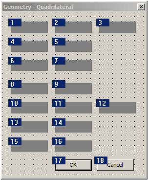
The controls you add to a dialog box are positioned in a sequence that follows the order they were added. When you add a control on the host that already has other controls, regardless of the section or area you place the new control, it is sequentially positioned at the end of the existing controls. If you do not fix it, the user would have a hard time navigating the controls. The sequence of controls navigation is called the tab order. While designing a dialog box, to change the sequential order of controls, on the main menu, click Format and click Tab Order or press Ctrl + D.
|
|
|||||||||||||||||||||||||||||||||||||||||||||||||||||||||||||||||||||||||||||||||||||||||||||||||||||||||||||
|
|
||||||||||||||||||||||||||||||||||||||||||||||||||||||||||||||||||||||||||||||||||||||||||||||||||||||||||||||
 Practical
Learning: Introducing Windows Controls
Practical
Learning: Introducing Windows Controls
 and click the dialog box
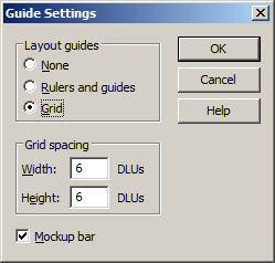
 ,
in the desired direction until it reaches the intended position.
,
in the desired direction until it reaches the intended position.