MFC Controls: The Tree Control
|
MFC Controls: The Tree Control |
|
Overview |
|
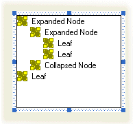
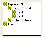
A tree control is an object that displays a hierarchical list of items arranged as a physical tree but a little upside down. The items display in a parent-child format to show those that belong to interrelated categories, such as parent to child and child to grandchild, etc; or folder to subfolder to file. Here is an example of a tree list: 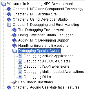
|
|
The starting item of the tree is sometimes called the root and represents the beginning of the tree. While most tree list have one root, it is not unusual to have a tree list that has many roots, as long as the tree creator judges it necessary. Here is an example: 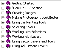 Each item, including the root, that belongs to the tree is referred to as a node. An item that belongs to, or depends on, another can also be called a leaf.
|
|
Tree List Properties |
| As mentioned already, a tree list is meant to display items in a list driven by a root and followed by one or more leaves. The items are mainly made of text. Optionally, to display a check box on the left side of the text, set the Check Boxes property to True or add the TVS_CHECKBOXES style (if you are using MSVC 6 and you had added the Tree Control button to the form or dialog box, open the resource file as text and manually add this style because it may not be available on the Properties window). | 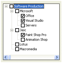 |
|
To guide the user with the tree items, the control uses tool tips. If you will need access to the information stored in tool tips, set the Info Tip property to True or add the TVS_INFOTIP style. If you do not want to display tool tips, set the Tool Tips property to False or create it with the TVS_NOTOOLTIPS style. |
|
When a node has children or leaves, to show this, you may want to display lines connecting these relationships. To do this at design time, set the
Has Lines property to True.
If you are programmatically creating the control and you want to display lines among related nodes, add the TVS_HASLINES style. |
 |
 |
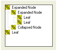
A node that has dependent children can display or hides them. To display its leaves, a node must be expanded. To hide its leaves, a node must collapse. These operations must be obvious to the user but something should indicate whether a node has dependent or not. This can be illustrated by a button that accompany such a node. To add these buttons to the control, at design time, set the Has Buttons property to True. This is equivalent to dynamically creating a tree list with the TVS_HASBUTTONS style |
| Unless you have a reason to do otherwise, it is usually a good idea to combine both the Has Buttons (or TVS_HASBUTTONS) and the Has Lines (or TVS_HASLINES) styles: | 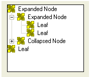 |
|
To show which item is the root, or which items play the roles of roots, of the tree list, you can display a line from the root(s) to the child(ren). To do this, at design time, set the Lines At Root property to True or add the TVS_LINESATROOT style. The line from the root(s) to to the child(ren) can display only if the control has the Has Lines property set to True or the TVS_HASLINES style. |
|
When using the list, the user typically selects an item by clicking it. If you want the mouse cursor to turn into a pointer finger and to underline the item when the mouse is over the node, set the Track Select property to True or create the control with the
TVS_TRACKSELECT style.
Once the mouse pointer is on top of the desired item, the user can click to select it. |
 |
|
When the user clicks another control or another application, the node that was selected would lose its selection as the tree control would have lost focus. If you want the tree to always show the selected item even if the control loses focus, set its Show Selection Always property to True or create the control with the
TVS_SHOWSELALWAYS style. |
|
Tree Controls Methods |
|
After adding or creating a tree control, you may want to fill it with the necessary items. Each node of the control is an HTREEITEM object. To create a new node, call the CTreeCtrl::InsertItem() method. It comes in various versions. One of them is: HTREEITEM InsertItem(LPCTSTR lpszItem,
HTREEITEM hParent = TVI_ROOT,
HTREEITEM hInsertAfter = TVI_LAST );
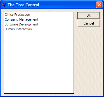
The easiest way to add an item consists of calling the InsertItem() method with a null-terminated string as argument because this is the only required argument of this version. Here is an example: BOOL CTree1Dlg::OnInitDialog()
{
CDialog::OnInitDialog();
// Set the icon for this dialog. The framework does this automatically
// when the application's main window is not a dialog
SetIcon(m_hIcon, TRUE); // Set big icon
SetIcon(m_hIcon, FALSE); // Set small icon
// TODO: Add extra initialization here
TreeSoft->Create(WS_CHILD | WS_VISIBLE | WS_BORDER | WS_TABSTOP,
CRect(10, 10, 240, 280), this, 0x1221);
TreeSoft->InsertItem("Office Production");
return TRUE; // return TRUE unless you set the focus to a control
}
In this case, the item would appear as the root. You can add as many nodes like that and each would appear as a root: BOOL CTree1Dlg::OnInitDialog()
{
CDialog::OnInitDialog();
// Set the icon for this dialog. The framework does this automatically
// when the application's main window is not a dialog
SetIcon(m_hIcon, TRUE); // Set big icon
SetIcon(m_hIcon, FALSE); // Set small icon
// TODO: Add extra initialization here
TreeSoft->Create(WS_CHILD | WS_VISIBLE | WS_BORDER | WS_TABSTOP,
CRect(10, 10, 240, 280), this, 0x1221);
TreeSoft->InsertItem("Office Production");
TreeSoft->InsertItem("Company Management");
TreeSoft->InsertItem("Software Development");
TreeSoft->InsertItem("Human Interaction");
return TRUE; // return TRUE unless you set the focus to a control
}
When calling this version of the InsertItem() method, if you do not pass the second argument, the node is created as root. This is because the root item has an
HTREEITEM value of TVI_ROOT, which is passed as default. You can also pass the second argument as NULL, which would produce the same effect. BOOL CTree1Dlg::OnInitDialog()
{
CDialog::OnInitDialog();
// Set the icon for this dialog. The framework does this automatically
// when the application's main window is not a dialog
SetIcon(m_hIcon, TRUE); // Set big icon
SetIcon(m_hIcon, FALSE); // Set small icon
// TODO: Add extra initialization here
TreeSoft->Create(WS_CHILD | WS_VISIBLE | WS_BORDER | WS_TABSTOP |
TVS_HASLINES | TVS_HASBUTTONS | TVS_LINESATROOT |
TVS_SINGLEEXPAND | TVS_SHOWSELALWAYS |
TVS_TRACKSELECT,
CRect(10, 10, 200, 240), this, 0x1221);
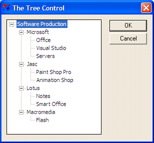
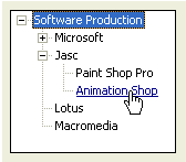
HTREEITEM hTree, hCompany;
hTree = TreeSoft->InsertItem("Software Production", TVI_ROOT);
hCompany = TreeSoft->InsertItem("Microsoft", hTree);
TreeSoft->InsertItem("Office", hCompany);
TreeSoft->InsertItem("Visual Studio", hCompany);
TreeSoft->InsertItem("Servers", hCompany);
hCompany = TreeSoft->InsertItem("Jasc", hTree);
TreeSoft->InsertItem("Paint Shop Pro", hCompany);
TreeSoft->InsertItem("Animation Shop", hCompany);
hCompany = TreeSoft->InsertItem("Lotus", hTree);
TreeSoft->InsertItem("Notes", hCompany);
TreeSoft->InsertItem("Smart Office", hCompany);
hCompany = TreeSoft->InsertItem("Macromedia", hTree);
TreeSoft->InsertItem("Flash", hCompany);
return TRUE; // return TRUE unless you set the focus to a control
}
When using the InsertItem() method as we have done so far, the items are added in the order of their appearance. Besides creating new nodes, the InsertItem() method also allows you to control the order in which to insert the new item. The new leaf can be added as the first or the last child of a node. To do this, pass a third argument to this version of the InsertItem() method and give it the TVI_FIRST to be the first child or TVI_LAST to be the last child of the current parent node. Here is an example: BOOL CTree1Dlg::OnInitDialog()
{
CDialog::OnInitDialog();
// Set the icon for this dialog. The framework does this automatically
// when the application's main window is not a dialog
SetIcon(m_hIcon, TRUE); // Set big icon
SetIcon(m_hIcon, FALSE); // Set small icon
// TODO: Add extra initialization here
TreeSoft->Create(WS_CHILD | WS_VISIBLE | WS_BORDER | WS_TABSTOP |
TVS_HASLINES | TVS_HASBUTTONS | TVS_LINESATROOT |
TVS_SINGLEEXPAND | TVS_SHOWSELALWAYS |
TVS_TRACKSELECT,
CRect(10, 10, 200, 240), this, 0x1221);
HTREEITEM hTree, hCompany;
hTree = TreeSoft->InsertItem("Software Production", TVI_ROOT);
hCompany = TreeSoft->InsertItem("Microsoft", hTree);
TreeSoft->InsertItem("Office", hCompany);
TreeSoft->InsertItem("Graphics Manipulation", hCompany, TVI_LAST);
TreeSoft->InsertItem("Project Management", hCompany);
TreeSoft->InsertItem("Software Develoment", hCompany);
TreeSoft->InsertItem("Operating Systems", hCompany, TVI_FIRST);
TreeSoft->InsertItem("Software Documentation", hCompany);
hCompany = TreeSoft->InsertItem("Jasc", hTree);
TreeSoft->InsertItem("Paint Shop Pro", hCompany);
TreeSoft->InsertItem("Animation Shop", hCompany);
hCompany = TreeSoft->InsertItem("Lotus", hTree);
TreeSoft->InsertItem("Notes", hCompany);
TreeSoft->InsertItem("Smart Office", hCompany);
hCompany = TreeSoft->InsertItem("Macromedia", hTree);
TreeSoft->InsertItem("Flash", hCompany);
return TRUE; // return TRUE unless you set the focus to a control
}
|
|
Tree Control Messages |
|
Most messages of the tree controls are notification messages that are sent to its parent window. For example, the
NM_CLICK message is sent to the dialog box or the form, that acts as the parent, that the tree control has been clicked. If the click was done with the right mouse button, the
NM_RCLICK message is sent instead. In the same way, if the user double-clicks the control an
NM_DBLCLK message is sent. If the user double-clicked with the right mouse button, the
NM_CDBLCLK message is sent. |
|
Tree Control With Bitmaps or Icons |
|
Bitmaps can be used to enhanced the display of items on a tree control. Each tree item can be configured to display or not to display a small picture on its left. To do this, you can declare a CImageList variable and add pictures to it. Once the image list is ready, you can call the CTreeCtrl::SetImageList() method. Its syntax is: CImageList* SetImageList(CImageList * pImageList, int nImageListType); The first argument, pImageList, is a pointer to a CImageList variable. The nImageListType argument specifies the type of image list that will be used. The possible values are:
HTREEITEM InsertItem(UINT nMask,
                                    LPCTSTR lpszItem,
                                    int nImage,
                                     int nSelectedImage,
                                     UINT nState,
                                     UINT nStateMask,
                                     LPARAM lParam,
                                     HTREEITEM hParent,
                                     HTREEITEM hInsertAfter );
HTREEITEM InsertItem(LPCTSTR lpszItem,
                                    int nImage,
                                    int nSelectedImage,
                                    HTREEITEM hParent = TVI_ROOT,
                                    HTREEITEM hInsertAfter = TVI_LAST);
The nMask argument specifies the type of value used to set on the list item. As seen already, the
lpszItem is the text that will be displayed for the current item. |
|
|
| Copyright © 2004-2015 FunctionX, Inc. |
|
|