|
Radio Buttons
Introduction
A radio button, also called an option button. is a Windows control made of a round box. In practical usage, a radio button is usually (if not always) accompanied by other radio buttons. In other words, radio buttons come as a group. The user makes
a decision by clicking one of the round boxes. There are two main ways you can
create radio buttons. You can follow the indications from a wizard (which is
usually the easier way) or you can manually add the radio buttons.
Before adding radio buttons to your form or report, you must
first add a container. To do this, you can use the Option Group control
 . If
a wizard comes
up, click Cancel. . If
a wizard comes
up, click Cancel.
To add a radio button to a form or report, in the Controls
section of the Ribbon, click the Option Button
 and click inside the target container on the form or report. Because the round box of a radio button does not indicate what it is used for, it is usually (if not always) accompanied by a label.
When you include a radio button, Microsoft Access adds a label to it, to its
right. You can change the position of the label to anywhere (to the left, the top, the right,
or the bottom side) you want, close to the round box. If you don't like the text
of the label, you can change or edit it.
and click inside the target container on the form or report. Because the round box of a radio button does not indicate what it is used for, it is usually (if not always) accompanied by a label.
When you include a radio button, Microsoft Access adds a label to it, to its
right. You can change the position of the label to anywhere (to the left, the top, the right,
or the bottom side) you want, close to the round box. If you don't like the text
of the label, you can change or edit it.
To move or position the round box, click it to select it.
Then position your mouse on it to get a 4-arrow cross and drag in the desired
direction.
Characteristics of Radio Buttons
If you want to create a group of radio buttons that are tied
to a table, in the table, you must create a column that has a natural number as
data type.
Because radio buttons work as a group, it is their group box
container, not each radio button, that is tied to the column of the table. This
means that, after adding an group box to a form or report, set its Record Source
to the column of the table.
In the Property Sheet, a radio button has a property named
Default Value. This is an incremental value that must be different for
each radio button in the group. The first, top or left radio button should have
a value of 1, the second should have a value of 2, and so on.
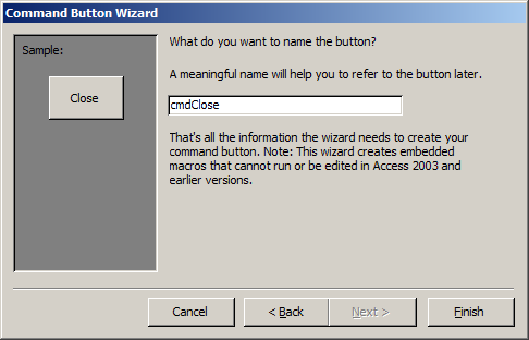
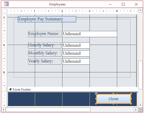
 Practical Learning: Adding Radio Buttons Practical Learning: Adding Radio Buttons
- On the Ribbon, click File and click Open
- In the list of files, click Ceil Inn1
- From the Navigation Pane, open the Employees form
- Switch the form to Design View
- In the Controls section of the Ribbon, click the Option Group control
- In the form, click under the Title text box.
If a wizard comes up,
click Cancel
- In the Property Sheet, click the All tab and change the following
characteristics:
Name: fraMaritalStatus
Record Source: MaritalStatusID
- Click the label in the top section of the group box
- In the Property Sheet, change the following characteristics:
Name: lblMaritalStatus
Caption: Marital Status
- In the Controls section of the Ribbon, click the Option Button
and click inside the option group you had added to the form
- In the Property Sheet, change the following characteristics:
Name: optSingle
Option Value: 1 (it should be set already)
- Click the label next to the radio button
- In the Property Sheet, click Caption and type Single
- In the Controls section of the Ribbon, click the Option Button
and click inside the option group you had added to the form
- In the Property Sheet, change the following characteristics:
Name: optMarried
Option Value: 2 (it should be set already)
- Click the label next to the radio button
- In the Property Sheet, click Caption and type Married
- Save the form
Automatically Generating a Group of Radio Buttons
Microsoft Access provides a means of easily creating a
group of radio buttons. This done by following the Option Group Wizard. To use
the wizard, make the Use Control Wizard button is on
 .
Among the advantages of using the wizard, it creates the captions of the buttons
(you provide the texts), it creates the default value for each radio button, it
allows you to select the radio button, and finally it proportionately positions
the radio buttons inside the group box. .
Among the advantages of using the wizard, it creates the captions of the buttons
(you provide the texts), it creates the default value for each radio button, it
allows you to select the radio button, and finally it proportionately positions
the radio buttons inside the group box.
Practical
Learning: Introducing the Group Box
- In the Controls section of the Ribbon, click the Option Group control
- Click an unoccuppied area of the form
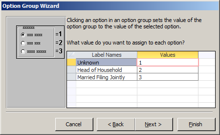
- In the first page of the wizard, type: Unknown and press the down arrow key
- Type: Head of Household and press the down arrow key
- Type : Married Filing Jointly
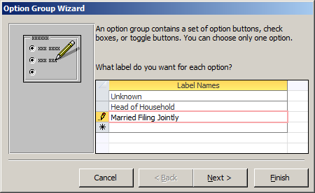
- Click Next
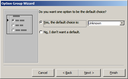
- Accept the dialog box and click Next
- In the dialog box, click the arrow of the combo box and select
FilingStatusID
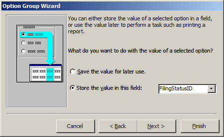
- Click Next
- Click Next
- In the Caption, type Filing Status
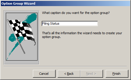
- Click Finish
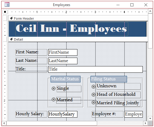
- On the form, click Marital Status
- Press and hold Shift
- Click Filing Status
- Release Shift
- In the Property Sheet, click Format and change the following
characteristics:
Back Color: Text 2, Lighter 60%
Font Name: Constantia (if you don't have that font, select Georgia)
Border Color:
Accent 1, Darker 50%
Fore Color: Background 1
- On the form, select all labels close each radio button (you can
click one of them, press and hold Shift, then click each label, and release
Shift)
- In the Format tab of the Property Sheet, change the following
characteristics:
Font Name: Constantia (if you don't have that font, select Georgia)
Fore Color: Text 1
- Set the Special Effect of all radio buttons to Flat
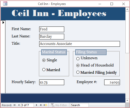
- Design the form as you see fit. Here is an example:
- Right-click somewhere in the Detail section of the form and click Tab Order
- In the Tab Order dialog box, click Auto Order
- Click OK
- Preview the form
- Save the form
Check Boxes
Introduction
A check box is a control that allows the user to validate or invalidate an option. A check box appears as a little square box. The user makes
a decision by clicking in the square, which puts a check mark in the square.
To add a check box to a form or report, in the Controls section of the Ribbon,
click the Check Box
 and click the form or report where you want to position the control.
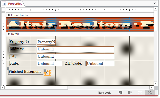
Practical Learning: Adding a Check Box
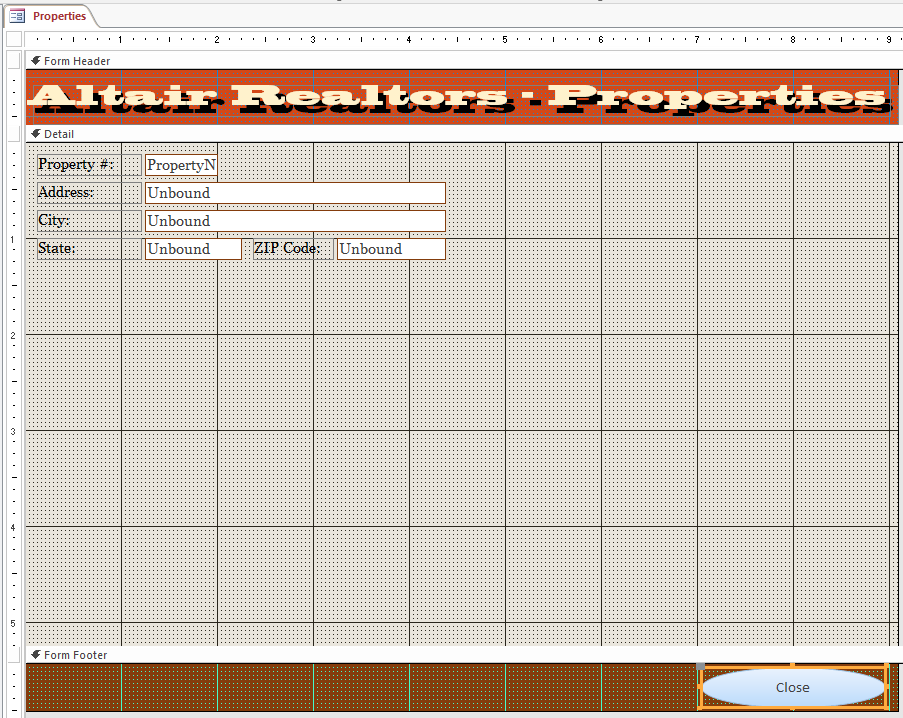
- On the Ribbon, click File and click Open
- In the list of files, click Altair Realtors1
- In the Navigation Pane, right-click the Properties table and click
Design View
- Click the first empty cell under Field Name
- Type FinishedBasement and press Tab
- Click the arrow of the Data Type combo box and select Number
- In the bottom section of the window, click Caption and type Finished Basement
- To switch the table, in the Design tab of the Ribbon, in the Views
section, click the View button
- When asked whether you want to save, click Yes
- Update the following records:
| Property # |
Finished Basement |
| 524880 |
1 |
| 688364 |
8 |
| 611464 |
4004 |
| 749562 |
995 |
| 427115 |
-10000 |
| 200417 |
0 |
| 927474 |
505 |
| 682630 |
-1750 |
| 288540 |
0 |
- Close the table
- In the Navigation Pane, right-click the Properties form and click
Design View
- In the Controls section of the Ribbon, click the Check Box control
and click and unoccupied area of the form
- Click the label next to it and, in the Property Sheet, click the
All tab
- Change the following properties:
Name: lblFinishedBasement
Caption:
Finished Basement
Characteristics of Check Boxes
If a check box will receive its value from a table, the
corresponding column must use a number-based data type. A check box is used to express a Yes/No value (also called a
Boolean value) as true or false. If the value of the record is 0, the check box
is unchecked. For any other value, the control is checked.
Sometimes, the decision cannot be made as a
definite true or a definite false. To support this eventuality, a check box can
assume an intermediate (or indeterminate) value. To provide this functionality,
the check is equipped with a property named Triple State. This
property is Boolean. If it is set to Yes, the check box can be true (checked),
undetermined (dimmed), or false (unchecked).
When you add a check box to a form or
report, it is accompanied by a label positioned to its right. The label is used
to indicate what the check box is used for, but the label can be moved or even
removed from the host. That is, the label can be treated independently.
If you click the check box itself, it becomes surrounded by
an orange box. Although you can resize that orange box, you cannot resize the
actual check box: it is managed by the operating system.
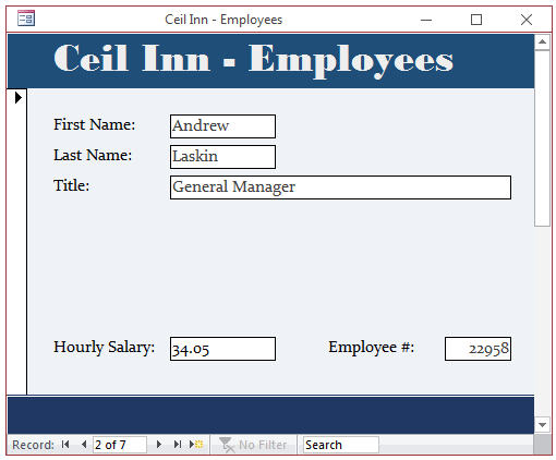
Practical Learning: Using Check Boxes
- In the form, click the check box next to Finished Basement to select it
- In the All tab of the Property Sheet, change the following properties:
Name: FinishedBasement
Control Source: FinishedBasement
- Move the label to the left of the check box and position both below the
other controls
- Close the form
- When asked whether you want to save the changes of the form, click Yes
Toggle Buttons
A toggle button is a type of button that behaves like a check box. It displays like a command button but behaves like a check box.
Also, while a check box should be accompanied by a label that indicates what the check box is used for.
A toggle button, like the command button, can display a string on its
"face".
To create a toggle button, click the Toggle Button control
 in the Controls section of the Ribbon
and click the form. Like the check box and the radio buttons, there is no wizard to follow.
in the Controls section of the Ribbon
and click the form. Like the check box and the radio buttons, there is no wizard to follow.
Practical Learning: Ending the Lesson
|

 in the Controls section of the Design tab of the Ribbon and click the desired section of the form. If the Use Control Wizard option is on
  .
. and
make sure the Use Control Wizards is set
and
make sure the Use Control Wizards is set
 of the
Picture field in the Format tab of the Property Sheet, locate the picture, and select it.
of the
Picture field in the Format tab of the Property Sheet, locate the picture, and select it.