GDI Tools: Brushes
|
|
GDI Tools: Brushes |
A brush is a drawing tool used to fill out a closed shape. It is similar to picking up a bucket and pouring its contents somewhere. In the case of computer graphics, the area where you position the brush is called the brush origin. The color (or picture) that the brush holds would be used to fill the whole area until the brush finds a limit set by some rule. A brush can be characterized by its color (if used), its pattern used to fill the area, or a picture (bitmap) used as the brush. The VCL provides support for brushes through the TBrush class. The TCanvas class has a TBrush member variable. This means that, any object that can receive or perform drawing, that is, every control that provides a Canvas member variable, already provides a TBrush variable ready for use. If you want to explicitly create a brush, you can declare a TBrush variable and use it to initialize the TCanvas::Brush member variable.
Because there can be so many variations of brushes, the Win32 library provides various functions for creating or managing brushes. Nevertheless, the Win32 API considers a brush to be a handle to a brush and it is defined as HBRUSH. Each of the functions used to create a brush returns HBRUSH.
Besides using a function to create a brush, the Win32 library provides the LOGBRUSH structure that can be used to create a logical brush by specifying its characteristics.
A brush is referred to as solid if it is made of a color simply used to fill a closed shape. The TBrush class is equipped with a Color member variable. To create a solid brush, simply assign a TColor value to the TBrush::Color variable. Here is an example:
Once a brush has been selected, it would be used on all shapes that are drawn under it, until you delete or change it. Here is an example:
If you want to use a different brush, you must change the characteristic(s) of the currently selected brush or create a new one. Here is an example:
To support solid brushes, the Win32 API provides the CreateSolidBrush() function. Its syntax is: HBRUSH CreateSolidBrush(COLORREF crColor); Therefore, to create a brush, you can call this function and pass it a COLORREF color value. Retrieve the return value of this function and use it to initialize the Handle member variable of the TBrush class.
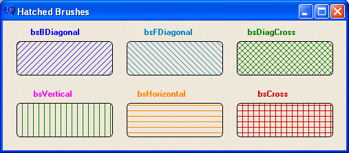
A hatched brush is one that uses a drawn pattern to regularly fill an area. Microsoft Windows provides 6 preset patterns for such a brush. To create a hatched brush, the TBrush class is equipped with the Style property. Style can have the following values: bsSolid, bsClear, bsBDiagonal, bsFDiagonal, bsCross, bsDiagCross, bsHorizontal, and bsVertical. The Win32 API supports hatched brushes through the CreateHatchBrush() function. Its syntax is: HBRUSH CreateHatchBrush(int fnStyle, COLORREF clrref ); The fnStyle parameter specifies the hatch pattern that must be used to fill the area. The possible values to use are HS_BDIAGONAL, HS_CROSS, HS_DIAGCROSS, HS_FDIAGONAL, HS_HORIZONTAL, or HS_VERTICAL. The clrref argument specifies the color applied on the drawn pattern. |
|
|
//---------------------------------------------------------------------------
void __fastcall TForm1::FormPaint(TObject *Sender)
{
	Canvas->Brush->Color = static_cast<TColor>(RGB(0, 0, 255));
	Canvas->Brush->Style = bsBDiagonal;
	Canvas->RoundRect( 20, 30, 160, 80, 10, 10);

	Canvas->Brush->Style = bsFDiagonal;
	Canvas->Brush->Color = static_cast<TColor>(RGB(0, 128, 192));
	Canvas->RoundRect(180, 30, 320, 80, 10, 10);

	Canvas->Brush->Style = bsDiagCross;
	Canvas->Brush->Color = static_cast<TColor>(RGB(0, 128, 0));
	Canvas->RoundRect(340, 30, 480, 80, 10, 10);

	Canvas->Brush->Style = bsVertical;
	Canvas->Brush->Color = static_cast<TColor>(RGB(0, 128, 0));
	Canvas->RoundRect(20, 120, 160, 170, 10, 10);

	Canvas->Brush->Style = bsHorizontal;
	Canvas->Brush->Color = static_cast<TColor>(RGB(255, 128, 0));
	Canvas->RoundRect(180, 120, 320, 170, 10, 10);

	Canvas->Brush->Style = bsCross;
	Canvas->Brush->Color = static_cast<TColor>(RGB(200, 0, 0));
	Canvas->RoundRect(340, 120, 480, 170, 10, 10);

	Canvas->Font->Style = TFontStyles() << fsBold;
	Canvas->Font->Color = static_cast<TColor>(RGB(0, 0, 255));
	Canvas->TextOut(40, 10, "HS_BDIAGONAL");
	Canvas->Font->Color = static_cast<TColor>(RGB(0, 128, 192));
	Canvas->TextOut(205, 10, " bsBDiagonal");
	Canvas->Font->Color = static_cast<TColor>(RGB(0, 128, 0));
	Canvas->TextOut(355, 10, " bsDiagCross");
	Canvas->Font->Color = static_cast<TColor>(RGB(255, 0, 255));
	Canvas->TextOut(44, 100, " bsVertical");
	Canvas->Font->Color = static_cast<TColor>(RGB(255, 128, 0));
	Canvas->TextOut(195, 100, " bsHorizontal");
	Canvas->Font->Color = static_cast<TColor>(RGB(200, 0, 0));
	Canvas->TextOut(370, 100, " bsCross");
}
//---------------------------------------------------------------------------
|
|
Logical Brushes |
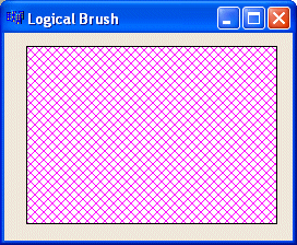
The Win32 library provides the LOGBRUSH structure to create a brush by specifying its characteristics. The LOGBRUSH structure is defined as follows:
typedef struct tagLOGBRUSH {
	UINT lbStyle;
	COLORREF lbColor;
	LONG lbHatch;
} LOGBRUSH, *PLOGBRUSH;
The lbStyle member variable specifies the style applied on the brush.
The lbColor is specified as a COLORREF value.
The lbHatch value represents the hatch pattern used on the brush. . It takes the same value as the fnStyle parameter of the CreateHatchBrush() function.
After initializing the LOGBRUSH variable, pass it to the CreateBrushIndirect() function. Its syntax is:
HBRUSH CreateBrushIndirect(CONST LOGBRUSH *lplb);
Here is an example:
//---------------------------------------------------------------------------
void __fastcall TForm1::FormPaint(TObject *Sender)
{
	LOGBRUSH LogBrush;

	LogBrush.lbStyle = BS_HATCHED;
	LogBrush.lbColor = RGB(255, 0, 255);
	LogBrush.lbHatch = HS_DIAGCROSS;

	HBRUSH NewBrush = CreateBrushIndirect(&LogBrush);
	Canvas->Brush->Handle = NewBrush;

	Canvas->Rectangle(20, 12, 250, 175);
}
//---------------------------------------------------------------------------
|
 |
|
Using Pens and Brushes: The Image Editor |
|
Introduction |
C++ Builder ships with a graphic application called Image Editor. Image Editor is used to create or manipulate small to medium, various types of, pictures needed in computer and graphic applications. These graphics are divided in categories that have different roles. Image Editor provides pens and brushes used to design its objects
|
Starting Image Editor |
There are various ways you can launch Image Editor:
|
Using the Image Editor |
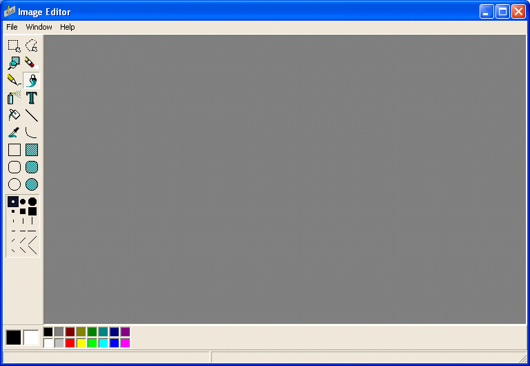
When Image Editor appears, it is mainly made of four areas.
On top, there is the title bar that displays Image Editor and the main menu. The title bar has the same classic look shared by Windows applications. Under the title bar, the menu, here called the main menu, allows you to perform all regular operations of an application. Image Editor is a Multiple Document Interface (MDI) application. This means that it allows you to open or work on different child windows. By default, when Image Editor starts, it does not create a new document. To create a graphic, you will have to let Image Editor know what kind of graphic you want to work on. Once you open or start a new document, the menu would change according to the type of graphic you are using.
To open an existing document, on the main menu, you can click File -> Open… and locate the desired document. To create a new document, on the main menu, you would click File -> New… and select the type of document you want.
The menu is used as on all other documents. For example, if you make a mistake on a graphic and want to dismiss the last action, you can click Edit -> Undo or press Ctrl + Z. In the same way, you can copy by clicking Edit -> Copy or pressing Ctrl + C. In other words, most of the shortcuts you are familiar with are available.
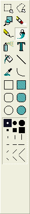 |
On the left side of the application, the Tools Palette displays buttons that will be used to create new graphics or manipulate existing ones.
To find out what a button is used for, position the mouse on top. A tool tip, or hint, would display. The buttons are used for various goals and exhibit different behaviors.
|
| Some tools such as the Pencil, lines, and the geometric shapes (rectangle, round rectangle, and ellipse) allow you to specify a width for their lines. |  |
| Some tools such as the Brush or the Spray allow you to select a thickness for the dot or mark they would apply to a graphic. To access this change, first select the Brush or Spray, then, in the lower section of the Tools Palette, select the the thickness you want. |  |
If you change the default line width of a tool, the selected width or thickness stays in memory and can be applied to a tool that does not obviously display this option. This happens if you a great width for a rectangle and then decide to use a Filled Rectangle tool, the last width would apply to the new tool. Therefore, if you do not want to use the same width, select the default before using another tool.
The main area of the application is made of a wide black rectangle that is used to host the graphics you will be using.
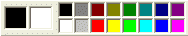
Like the top section, the bottom area of the application contains two objects. The Color Palette displays a list of 16 colored buttons (by default)
Under the Color Palette, there is the Status Bar.
After using Image Editor, you can close it. You have a few alternatives:
When closing Image Editor, if you had a modified document that needs to be saved, you would be prompted to save it.
Graphics used in the Windows operating system are divided in categories. Probably the most popular of the graphics natively used in the operating system is called a bitmap.
|
Icons |
|
Introduction |
Like a bitmap, an icon is used to display graphics on window objects. While a bitmap can have any dimension the window needs, the size of an icon must be limited. This is because icons assume different roles on an application.
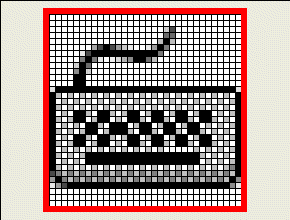
Icons are used to represent folders in Windows Explorer and My Computer:
|
Creating Icons |
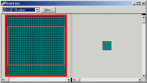
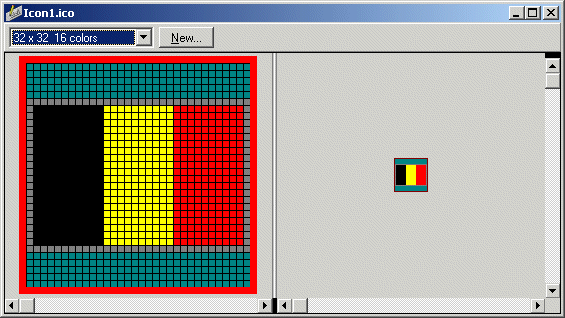
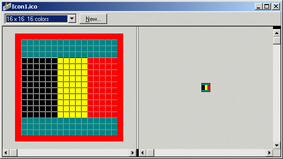
To create an icon, on the main menu of Image Editor, you can click File -> New… -> Icon File (.ico). This would call the Icon Properties dialog box, which allows you to specify the icon as a 16x16 or 32x32 pixel graphic. You can also design an icon that consists of 2 or 16 colors. After creating and designing your icon you must save it. An icon is a Windows file whose extension is .ico
|
|


|
Cursors |
|
Introduction |
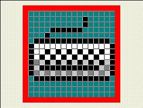
Cursors are another type of application accessory you can design using pens and brushes in Image Editor. A cursor is a small graphic that represents the position of the mouse on a Windows screen. Because Windows is a graphic-oriented operating system, when it installs, it creates a set of standard or regularly used cursors. These can be seen by opening the Control Panel window and double-clicking the Mouse icon. This opens the Mouse Properties dialog box where you can click the Pointers tab to see a list of standard cursors installed by Windows:

|
Creating Cursors |
Microsoft Windows installs a wide array of cursors for various occasions. Besides the cursors provided by Windows, Borland C++ Builder installs additional cursors that can accommodate even more scenarios. If these are still not enough, you can create your own cursors. Using your own, custom cursors involves more steps than using bitmaps and icons.
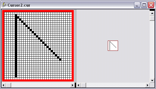
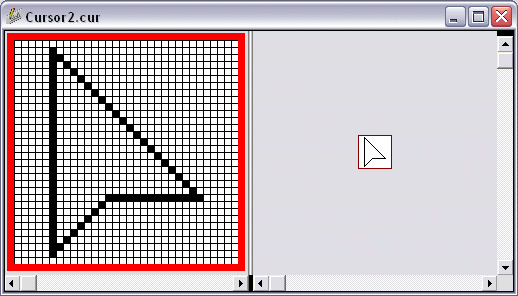
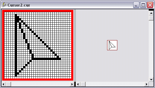
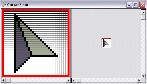
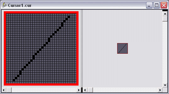
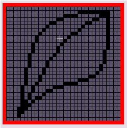
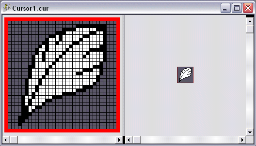
To create your own cursor, on the main menu of Image Editor, you can click File -> New -> Cursor File (.cur). A starting but empty cursor would be displayed. After designing a cursor, you must save it. It has an extension of .cur.
Essentially, a cursor uses only two colors, black or white. This is because a cursor is only used as an indicator of the presence or position of the mouse pointer on the screen. Based on this (limitation), you ought to be creative. The minimum you can give a cursor is a shape. This can be a square, a rectangle, a circle, an ellipse, a triangle, or any shape of your choice. You can make the cursor fully black by painting it with that color. If you decide to make the cursor completely white, make sure you draw the borders of the cursor. By playing with the frequency of pixels and varying the frequencies of black and white, you can create variances of gray.
Between the black and white colors, two gray degrees are provided to you. In reality these two colors are used to give a transparency to the cursor so the background can be seen when the mouse passes over a section of the document.
|
|
|
Other Techniques of Creating Icons and Cursors |
|
Icons and Cursors Design |
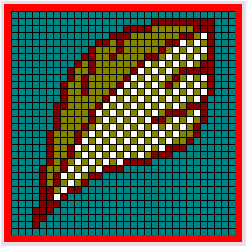
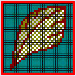
Sometimes in your application, you will want to use the same picture for a bitmap, an icon, and a cursor. Although each category has some predefined rules regarding its design, you can still cleverly use a common design among them. This can be done by simply copying one graphic from one category and pasting it into another category. All you have to do is to adapt the pasted picture to the category you are designing. Of course, there are some rules you will submit to.
If you want to use the same design for a bitmap and an icon, it must be designed with a maximum width and height of 32 pixels. This means that you can use 16, 24, or 32 pixels width and height and you must use a maximum of 16 colors. If you want to use the same design for a bitmap, an icon, and a cursor, you should use a graphic that fits in 32 pixels width and height. Although you can interchangeably copy and paste between a bitmap and an icon, when pasting the same graphic into a cursor, keep in mind that you would be restricted to 2 colors only.
|
|
 |
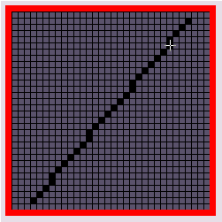
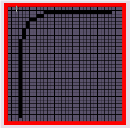
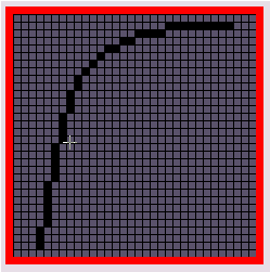
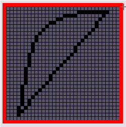
In the following exercise, the instructions are approximate and you should not take them exactly at face value. As long as you draw a line that approximately resembles the screenshot, you are fine. You do not have to have exactly the same result as the corresponding screenshot. |
 |
 |
 |
 |
 |
 |
 |
 |
 |
 |
|
Transforming an Icon or a Cursor |
Besides creating an object from scratch or modifying an existing one we have seen in a few examples so far, you can play with various pictures on your computer or from other resources and get very creative bitmaps, icons, or cursors. This technique consists of taking an object that, by default, in not a bitmap, icon, or cursor, and transforming it into one.
Microsoft Windows installs a few fonts for its internal use and yours. Besides these fonts, you can also purchase new ones. Some of these fonts have curious types of characters you can use for your graphics objects. You can also find icons on the Internet and transform them.
If you find a character of a font that you want to use as an icon or a cursor, you can select it. You should be able to paste it into Image Editor but Image Editor does not faithfully retrieve objects from the clipboard. Therefore, you should first paste it into Microsoft Paint, copy it from Microsoft Paint, and then paste it into the type of graphic you want to create in Image Editor. The only thing left to do is to customize the appearance of your object.
|
|


|
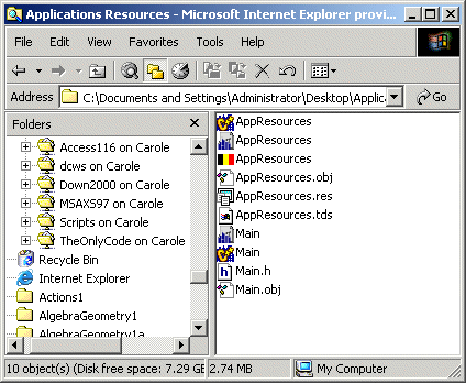
Applications Resources |
|
Introduction |
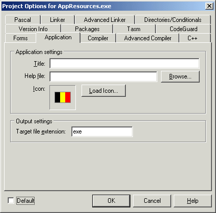
In the programming world, a resource is any external object that you can use to complete your application. As you have seen so far, we had to use an external application to create icons and cursors. For a regular application, a resource can be picture, a sound file, a dialog box, a cursor, a menu, an icon, anything. Most of the time, when you need one of these, first check if you can get it inside C++ Builder; that will be the case for all dialog boxes and menus we will use in this book. Some other resources just have to be gotten from another application. For example, although you can program a music application in C++ Builder, you cannot create a music file using it; you would need an external application.
There is no strict rule on what a resource is or is not, except that it is a file with an extension. For a programming resource file, it (primarily) has an extension of rc dcr that helps the compiler identify it. In order to use it in your application, the file has to be compiled into a format that the compiler can understand. Fortunately, you can do this compilation and include the file into your application from C++ Builder. You must first create and gather the necessary resources, then make them available to your application.
|
Creating a Resource File |
Although there are, and can be, various types of resources, here we will cover only icons and cursors. A resource for an application can include icons, pictures (bitmaps), and cursors. To create such a resource, on the main menu of Image Editor, you can click File -> New... You can click either Component Resource File (.dcr) or Resource File (.res). Once you have a resource file, you can add the objects by right-clicking, New, and clicking the category of object you want to include.
C++ Builder in combination with Image Editor make the process of using a resource file easy. You have two main alternatives.
|
|

//---------------------------------------------------------------------------
#ifndef MainH
#define MainH
//---------------------------------------------------------------------------
#include <Classes.hpp>
#include <Controls.hpp>
#include <StdCtrls.hpp>
#include <Forms.hpp>
const int PushAway = 1;
const int WriteItDown = 2;
//---------------------------------------------------------------------------
class TForm1 : public TForm
{
__published: // IDE-managed Components
private: // User declarations
public: // User declarations
	__fastcall TForm1(TComponent* Owner);
};
//---------------------------------------------------------------------------
extern PACKAGE TForm1 *Form1;
//---------------------------------------------------------------------------
#endif
|
//---------------------------------------------------------------------------
__fastcall TForm1::TForm1(TComponent* Owner)
: TForm(Owner)
{
	Screen->Cursors[PushAway] = LoadCursor(HInstance, "POINTME");
	Screen->Cursors[WriteItDown] = LoadCursor(HInstance, "SCRIPTER");
}
//---------------------------------------------------------------------------
|
//---------------------------------------------------------------------------
void __fastcall TForm1::FormCreate(TObject *Sender)
{
	Panel1->Cursor = TCursor(PushAway);
	Memo1->Cursor = TCursor(WriteItDown);
}
//---------------------------------------------------------------------------
|


| Home | Copyright © 2005-2016, FunctionX | |
 Practical
Learning: Displaying Brush Hatches
Practical
Learning: Displaying Brush Hatches