Windows Controls: The Edit Control
|
|
Windows Controls: The Edit Control |
|
Introduction to Edit Controls |
|
Description |
|
An edit box is a Windows control used to get or display text for the user’s interaction. At its most regular use, an edit box serves as a place to fill out and provide information. Such a use is common on employment applications, login dialog boxes, etc. |
|
Like most other controls, the role of an edit box is not obvious at first glance; that is why it should be accompanied by a label that defines its purpose. From the user’s standpoint, an edit box is named after the label closest to it. Such a label is usually positioned to the left or the top side of the edit box. From the programmer’s point of view, an edit box is a placeholder used for various things. For example, you can show or hide it as you see fit. You can also use it only to display text without allowing the user to change it. |
To create an edit box, once again, C++Builder provides a
lot of choices. The most fundamental edit box is designed with the TEdit
control
The most important aspect of an edit box is its text, whether it is displaying or requesting it. This is the Text property. When you add an edit control, C++Builder initializes it with the name of the control; this would be Edit1 for the first edit box, Edit2 for the second, etc. If you want the control to display some text when the form launches, type the text in the Text property field in the Object Inspector. Otherwise, if you want the edit box to be empty when it comes up for the first time, delete the content of the Text field.
By default, the user can enter considerably long text in an edit control. To let you control the maximum number of characters that the edit control can hold, the TCustomEdit class is equipped the MaxLength property: __property int MaxLength = {read=FMaxLength,write=SetMaxLength};
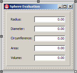
By default, an edit control starts displaying its text to the left side. Still, you have the option of positioning it to the left, the center, or the right side. This characteristic is controlled by the Alignment property of the TCustomEdit class. At design time, to specify it, use the Object Inspector. Otherwise, to programmatically specify the alignment of the text, assign the desired value to the Alignment property.
By default, a newly created edit box is used to both display and receive text from the user. If you want to user to read text without being able to change it, set the ReadOnly Boolean property to true. Its default value is false. As mentioned already, an edit box should be accompanied by a label that indicates what it is used for. To support this relationship, the Label control provides various properties. An accelerator character is a symbol of the label that provides easy access to its edit box. On the label, such a character is underlined. An example would be First Name. The idea is that, if the user presses Alt key in combination with the label’s underlined characters, the edit box it accompanies would receive focus.
To create an accelerator key, choose one of the label’s characters and precede it with an ampersand character when setting its caption. An example would be &First Name. If you want a label to display the accelerator character instead of a plain ampersand, set the label’s ShowAccelChar property to true. If you set it to true but need to display an ampersand, type two & characters where the ampersand would be shown. The ShowAccelChar property of a label is only used to indicate that the label will display an accelerator character and the & symbol typed on the label creates that accelerator character. To indicate which edit box would receive focus when the accelerator character of the label is invoked, the label control provides the FocusControl property. To use this property, select the label on the container. Then, on the Object Inspector, click the FocusControl field to display its combo box. From there, you can select one of the existing controls. The control, such as an edit box, must be able to receive focus.
|
|||||||||||||||||||||||||||||||||||||||||||||||||||||||||||||||||||||||||||||||||||||||||
The Edit control is equipped with many events. Some of these events are from its parent class the TCustomEdit class and some others are from ancestor classes. An edit control shows that it has focus when the caret blinks in it. To use an edit control, the user can click it. When this happens the control fires an OnClick event. If the form or container has many controls, the user can press Tab continuously until the caret displays in the edit box. In this case, the control would fire an OnEnter event.
After using the edit control, the user can click another control or the user can press Tab. In both cases, the edit control that had the caret loses focus. At this time, the control fires an OnExit event.
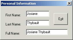
The OnChange() event occurs as the user is typing text in the control. This happens as the user is changing the content of an edit control; this sends a message that the content of the edit box has changed or has been updated. You can use this event to check, live, what the user is doing in the edit box. For example, if you create a dialog with a first and last names edit boxes, you can use another edit box to display the full name. The controls could be drawn as follows:
You can implement the OnChange event of the first name edit box as follows: //---------------------------------------------------------------------------
void __fastcall TfrmPersInfo::edtFirstNameChange(TObject *Sender)
{
edtFullName->Text = edtFirstName->Text + " " + edtLastName->Text;
}
//---------------------------------------------------------------------------
When the second edit box is being edited, you can implement its OnChange event as follows: //---------------------------------------------------------------------------
void __fastcall TfrmPersInfo::edtLastNameChange(TObject *Sender)
{
edtFullName->Text = edtFirstName->Text + " " + edtLastName->Text;
}
//---------------------------------------------------------------------------
The edit control recognizes all the events associated with the keyboard and these are particularly important because the edit box is the most commonly used control for typing. All three keyboard events are dealt with sequentially when the user types. When the user presses a key to type, the control fires an OnKeyDown event. As soon as the user releases the key, the control fires an OnKeyUp event. If you want to find out what key the user had pressed, use the OnKeyPress event.
To use an edit control, the user can enter text or change the text in it. To keep track of the changes, the TCustomEdit class is equipped with a Boolean property named Modified and that its child controls inherit: __property bool Modified = {read=GetModified,write=SetModified};
You can programmatically acknowledge that the control has been modified by setting the Modified property to true. Whenever the user changes the text in the edit control, the control fires an event named OnChange. This event is of type a TNotifyEvent type. This event is useful if you want to display a notification that the text is not as it was when the form opened.
The CharCase property of an edit control allows the content of a text box to apply a character case of your choice. The CharCase property is controlled by the TEditCharCase enumerator defined as follows: enum TEditCharCase { ecNormal, ecUpperCase, ecLowerCase };
By default, it is set to ecNormal, which respects whatever character case is typed in an edit box. Otherwise, you can set it to ecUpperCase or ecLowerCase to set the edit box’ characters to uppercase or lowercase respectively.
Text typed in an edit box appears with its corresponding characters unless you changed the effect of the CharCase property from ecNormal. This allows the user to see and be able to read the characters of an edit. If you prefer to make them un-readable, you can use the PasswordChar property. Although this property is a char type of data, changing it actually accomplishes two things. Its default value is #0, which means that the characters typed in it will be rendered in their alphabetic corresponding and readable characters. If you change it, for example to *, any character typed in it would be un-readable and be replaced by the value of this property. You can use any alphabetic character or digit to represent the characters that would be typed but you must provide only one character. Alternatively, you can specify an ASCII character instead. To do this, type # followed by the number representing the ASCII character. For example, #98 would display b for each character.
When using a form, the user can press Tab to move from one control to another. By default, when such a control receives focus from the user pressing Tab, the whole text in an edit control is selected. This is controlled by the AutoSelect property. If you do not want that, you can set the AutoSelect Boolean property to false. One of the actions the user may be asked to perform on an edit box is to type text in it. If the control already contains text, the user can read it. Another common action the user performs is to select text contained in the control. The user must have the option to select only part of the text or its whole content. To do this, the user can click and hold the mouse on one end of the selection and drag to the desired end. This allows for partial selection. The area where the user start dragging during selection is represented by the SelStart property. When the user ends the selections, the length of the text selected is represented by the SelLength property. The portion of text selected is represented by the SelText property, which is an AnsiString type. These properties allow you either to programmatically select text or to get information about text that the user would have selected in the edit box.
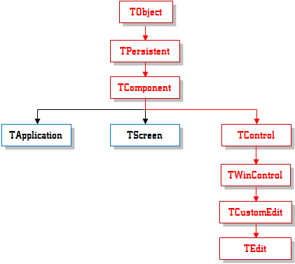
The edit control is based on the TEdit class whose immediate parent is TCustomEdit. Like every VCL class, it has a constructor and a destructor. The constructor can be used to dynamically create an edit control. The TEdit class provides other methods derived from the control’s parent or from ancestor classes. We saw earlier the properties related to the selection of text from an edit control performed either by you or by a user. Alternatively, the user may want to select the whole content of the control. To programmatically select the whole text of an edit control, call the SelectAll() method. Its syntax is: void __fastcall SelectAll(); If the user or another control or action had selected text on the edit control, you can delete the selection using the ClearSelection() method of the TCustomEdit class. Its syntax is: void __fastcall ClearSelection(void); This method first finds if some text is selected. If so, the selected text would be discarded. If nothing is selected, the method would not do anything. To delete a selected text, you can write: //---------------------------------------------------------------------------
void __fastcall TForm1::btnClearSelectionClick(TObject *Sender)
{
Edit1->ClearSelection();
}
//---------------------------------------------------------------------------
The contents of an edit box can be empty or contain some text. If you want it empty, use the Clear() method of the TCustomEdit class. Its syntax is: virtual void __fastcall Clear(void); This would delete the whole contents of the control: //---------------------------------------------------------------------------
void __fastcall TForm1::btnClearClick(TObject *Sender)
{
Edit1->Clear();
}
//---------------------------------------------------------------------------
The edit control natively supports regular operations performed on a text control such as undoing an action, cutting or copying text from the control, pasting text from another control. The methods used to accomplish these assignments are Undo(), CutToClipboard(), CopyToClipboard(), PasteFromClipboard(). Their syntaxes are: void __fastcall Undo(void); void __fastcall CutToClipboard(void); void __fastcall CopyToClipboard(void); void __fastcall PasteFromClipboard(void); |
|
|||||||||||||||||||||||||||||||||
|
|
|
|
||
| Home | Copyright © 2010-2016, FunctionX | |
|
|
||
 Practical
Learning: Introducing Edit Controls
Practical
Learning: Introducing Edit Controls and draw a rectangle
 of the Standard section of the Tool Palette. The TEdit
class is based on the TCustomEdit class that itself is
derived from TWinControl:
of the Standard section of the Tool Palette. The TEdit
class is based on the TCustomEdit class that itself is
derived from TWinControl: