|
 Practical Learning: Creating a Status Bar Practical Learning: Creating a Status Bar
|
|
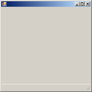
- From the Menus & Toolbars section of the Toolbox, click StatusStrip
 and click the form
- While the tool strip is still selected, in the Properties window,
change its Name to stbApplicationStatus
|
Characteristics of a Status Bar
|
|
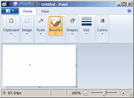
A status bar can be used for its aesthetic
characteristics as it can be made to display sunken or raised bars to the
bottom of a form:
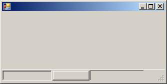
Other than that, a status bar can be made to display
other items.
Like a toolbar, a status bar is an intermediary
container, meaning it must be positioned on another container, which is
usually a form. The default Dock value of a status bar is
Bottom.
|
The Items on a Status Bar
|
|
To manage its panels, the StatusStrip
class inherits the functionalities of its panels from the inherited
Items property. As seen for the ToolStrip ^
toolbar, to create the panels of a status bar, do one of the following:
- Click the status bar to select it on the form. Click the arrowed
button on its top-right side and click Edit Items...
- Right-click the status bar and click Edit Items...
- Click the status bar on the form to select it. Then, under the
Properties window, click Edit Items...
This would open the Items Collection Editor. Use it to
add the desired items that would then create the panels.
Like a toolbar, a status bar can host some items. A
status bar is primarily used to display text. To get such text, you can
create a label and add it to the status bar. A label on a status bar is an
object of type ToolStripStatusLabel. The
ToolStripStatusLabel class inherits from a class named
ToolStripLabel.
To visually add a label to a status bar:
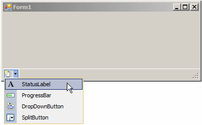
- Click an empty area on the status bar to create a new button. Click
the arrow of the new button and click StatusLabel
- Display the Properties window for the status bar. In Select Item And
Add To List Below, select StatusLabel and click Add
To programmatically add a label to a status bar, declare
a variable of type ToolStripStatusLabel, initialize it, and
add it to the Items property of the StatusStrip
variable. Here is an example:
#include <windows.h>

#using <System.dll>
#using <System.Drawing.dll>
#using <System.Windows.Forms.dll>

using namespace System;
using namespace System::Drawing;
using namespace System::Windows::Forms;

public ref class CExercise : public Form
{
private:
    StatusStrip ^ statusbar;
    ToolStripStatusLabel ^ lblMessage;

public:
    CExercise()
    {
	InitializeComponent();
    }

private:
    void InitializeComponent()
    {
        statusbar = gcnew StatusStrip;

        lblMessage = gcnew ToolStripStatusLabel;
        statusbar->Items->Add(lblMessage);

        Controls->Add(statusbar);
        Text = L"Exercise";
        StartPosition = FormStartPosition::CenterScreen;
    }
};

int APIENTRY WinMain(HINSTANCE hInstance,
		     HINSTANCE hPrevInstance,
		     LPSTR lpCmdLine,
		     int nCmdShow)
{
    Application::Run(gcnew CExercise());

    return 0;
}
Like the label of a toolbar, the label of a status bar
can be made to display text, an icon, or both. This is handled by the
DisplayStyle property that has the same options as the
other.
The label of a status bar is highly configurable. It has
the ability to sink or raise its borders. If you want to control the borders
of a label, first use its BorderSides property:
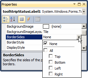
You can do this programmatically as follows:
void InitializeComponent()
{
    statusbar = gcnew StatusStrip;
    lblMessage = gcnew ToolStripStatusLabel;
    lblMessage->BorderSides = ToolStripStatusLabelBorderSides::All;

    statusbar->Items->Add(lblMessage);
    Controls->Add(statusbar);
}
After setting the BorderSides
property, select the type of border you want in the BorderStyle property:
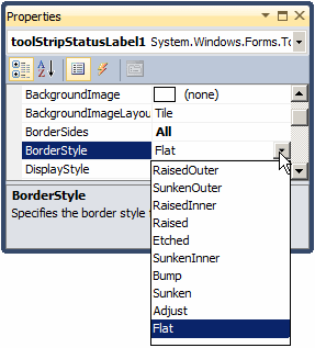
You can also specify the border style programmatically.
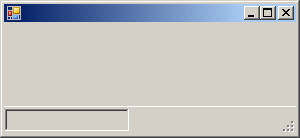
Here is an example:
void InitializeComponent()
{
    statusbar = gcnew StatusStrip();

    lblMessage = gcnew ToolStripStatusLabel();
    lblMessage->AutoSize = false;
    lblMessage->Width = 125;
    lblMessage->BorderSides = ToolStripStatusLabelBorderSides::All;
    lblMessage->BorderStyle = Border3DStyle::Sunken;

    statusbar->Items->Add(lblMessage);
    Controls->Add(statusbar);
}
This would produce:
Besides the label, a status bar can also contain a drop
down button, a split button, and/or a progress bar.
|
Practical Learning: Populating a Status Bar
|
|
- On the form, to create a section, click the button that displays
- While the new label is still selected, in the Properties window,
change the following characteristics:
(Name): pnlMessage
AutoSize: False
BorderSides: All
BorderStyle: Sunken
DisplayStyle: None
Size -> Width: 200
- On the form, click the new button on the right side of the previous
label
- While the new label is still selected, in the Properties window,
change the following characteristics:
(Name): pnlStatus
AutoSize: False
BorderSides: All
BorderStyle: Raised
DisplayStyle: None
Size -> Width: 150
- On the form, click the new button on the right side of the previous
label (you should now have three labels)
- While the new label is still selected, in the Properties window,
change the following characteristics:
(Name): pnlZoom
BorderSides: All
BorderStyle: SunkenOuter
DisplayStyle: None
Spring: True
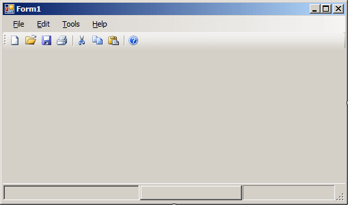
- Close Microsoft Visual Studio
- When asked whether you want to save, click Discard
|

 and click the form
 and click the form
 and click the form