|
Overview of Controls Properties |
|
A property is a piece of information that characterizes or describes a control. It could be related to its location or size. It could be its color, its identification, or any visual aspect that gives it
meaning.
The properties of an object can be changed either at design time or at run time. You can also manipulate these characteristics both at design and at run times. This means that you can set some properties at design time and some others at run time.
To manipulate the properties of a control at design time, first click the desired property from the
Toolbox. Then add it to the form or to a container control. To change the properties of a control at design time, on the form, click the control to select it. Then use the
Properties window:
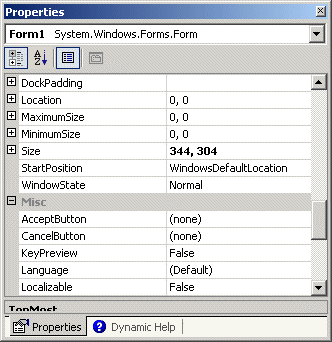 The items in the Properties window display in a list
set when installing Microsoft Visual Studio. In the beginning, you may be regularly
lost when looking for a particular property because the list is not
arranged in a strict order of rules. You can rearrange the list. For
example, you can cause the items to display in alphabetic order. To do
this, in the title bar of the Properties window, click the Alphabetic
button  . To
restore the list, you can click the categorized button . To
restore the list, you can click the categorized button  . .
When a control is selected, the Properties window
displays only its characteristics. When various controls have been selected, the
Properties window displays only the characteristics that are common to the
selected controls.
Each field in the Properties window has two sections: the property’s
name and the property's value:
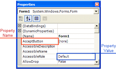
The name of a property is represented on the left column. This is the
official name of the property. Notice that the names of properties are in
one word. You can use this same name to access the property in code.
The box on the right side of each property name represents the value of
the property that you can set for an object. There are various kinds of
fields you will use to set the properties. To know what particular kind a
field is, you can click its name. To set or change a property, you use
the box on the right side of the property’s name: the property's value,
also referred to as the field's value.
 |
By default, these fields have nothing in their properties. Most of these properties are dependent on other settings of your program. For example, you can set a menu property for a form only after you have created a menu.
To set the property on such a field, you can type in it or select from a list.
|
|
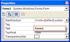
There are fields that expect you to type a value. Most of these fields have a default value.
To change the value of the property, click the name of the property,
type the desired value, and press Enter. While some properties, such as the
Text, would allow anything, some other fields expect a specific type of text, such as a numeric value.
|
|
Some fields expect a numeric value. In this case, you can
click the name of the field and type the desired value. If you type an invalid
value, you would receive a message box notifying you of the error:
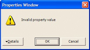
When this happens, click OK and type a valid value. If the
value is supposed to be an integer, make sure you don't type it as a decimal
number.
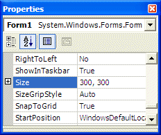 |
Some fields have a + button. This indicates that the
property has a set of sub-properties that actually belong to the same
property and are defined together. To expand such a field, click its + button
and a – button will appear: |
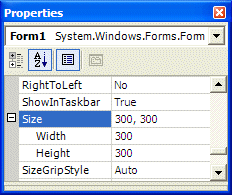 |
To collapse the field, click the – button. Some of the properties are
numeric based, such as the Size. With such a property, you can click
its name and type two numeric values separated by a comma. Some other
properties are created from an enumerator or a class. If you expand such a
field, it would display various options. Here is an example from the Font
property:
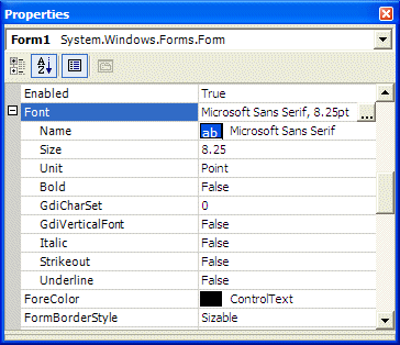
With such a property, you should select from a list.
 |
Some fields can have only a True or False value. To change their setting, you can either select from the combo box or double-click the property to toggle to the other value. |
Some fields would require a value or item that needs to be
set through an intermediary action. Such fields display an ellipsis button. When you click the button, a dialog box would come up and you can set the value for the field.
|
 |
To change the value of some of the fields, you would use their combo
box to display the available values. After clicking the arrow, a list would display:
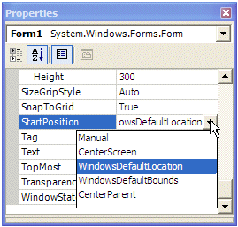
There are various types of list-based fields. Some of them display just
two items. To change their value, you can just double-click the field. Some other fields have
more than two values in the field. To change them, you can click their arrow and select from
the list. You can also double-click a few times until the desired value is selected.
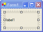
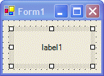
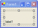
Some properties are used to specify the alignment of text or
picture on the control. The field of such a property is equipped with an arrow
like the one of a combo box. When you click the arrow of the field, it displays
a window with 8 positions:
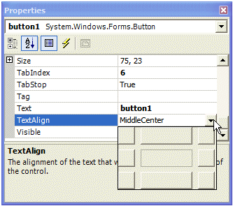
You will be asked to click the indicated position. Each
position has a name based on the enumerator that controls the property. The
values of this type of property are:
| TopLeft |
TopCenter |
TopRight |
 |
 |
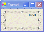 |
| MiddleLeft |
MiddleCenter |
MiddleRight |
 |
 |
 |
| BottomLeft |
BottomCenter |
BottomRight |
 |
 |
 |
|
|