To specify the size of a control during design, access its Properties window:
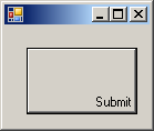
To support the size of an object, the System.Drawing namespace defines the Size structure. There are four characteristics that define a Size value: its location and its dimensions. A Size value must have a starting point (X, Y) just as the Point object was illustrated earlier. The width is the distance from the left to the right borders of a Size object. The height represents the distance from the top to the bottom borders of a Size value: 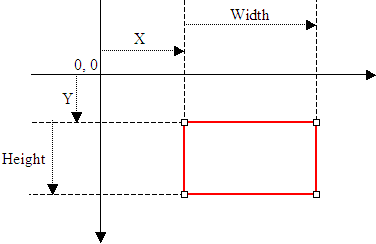 To assist you with sizes, the Size structure provides the following constructor: public Size(int width, int height); Using this constructor, to programmatically specify the size of a control, assign a Size value to its Size property. Here is an example: using System;
using System.Drawing;
using System.Windows.Forms;
public class Exercise : Form
{
private Button btnSubmit;
private void InitializeComponent()
{
btnSubmit = new Button();
btnSubmit.Text = "Submit";
btnSubmit.Location = new Point(100, 40);
btnSubmit.Size = new Size(80, 32);
Controls.Add(btnSubmit);
}
public Exercise()
{
InitializeComponent();
}
}
public class Program
{
static int Main()
{
Application.Run(new Exercise());
return 0;
}
}
You can also define a Size object using a Point value. To support this, the Size structure is equipped with the following constructor: public Size(Point pt); After declaring a variable with this constructor, you can access its Width and Height properties to complete the definition of the Size object. If you already have the size of an object, you may only want to specify the dimensions of the variable. To do this, you can use the Besides the Size, the System.Drawing namespace also provides the SizeF structure. It uses the same properties as Size except that its members float types. To retrieve the dimensions of a control, you can get its Size property and assign it to a Size object.
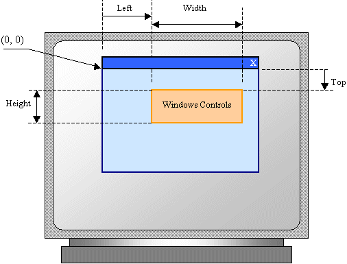
The combination of the location and size of an object is represented as a rectangle: a geometric figure with four sides. To support this figure, the System.Drawing namespace provides the Rectangle and the RectangleF structures. A rectangle can be represented as follows: 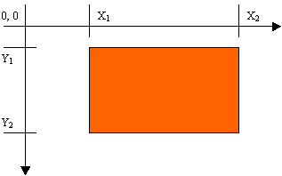 Like every geometric representation in your program, a rectangular figure is based on a coordinate system whose origin is located on a top-left corner. The object that "owns" or defines the rectangle also owns this origin. For example, if the rectangle belongs to a control that is positioned on a form, then the origin is on the top-left corner just under the title bar of the form, provided the form has a title bar. To completely represent it, a rectangle is defined by its location and its dimensions. The location is defined by a point on the top-left corner of the rectangle. The distance from the left border of the object that owns the rectangle to the left border of the rectangle is represented by a property called Left. The distance from the top border of the object that owns the rectangle to the top border of the rectangle is represented by a property called Top. The distance from the left to the right borders of the rectangle is represented by a property called Width. The distance from the left to the right borders of the rectangle is represented by a property called Height. The distance from the left border of the object that owns the rectangle to the right border of the rectangle is represented by a property called Right. The distance from the top border of the object that owns the rectangle to the bottom border of the rectangle is represented by a property called Bottom. Based on this, a rectangle can be illustrated as follows: 
To create a rectangle, you must provide at least its location and dimensions. The location can be represented by a Point value and the dimensions can be represented with a Size value. Based on this, you can use the following constructor to declare a Rectangle variable: public Rectangle(Point location, Size size); This constructor requires that you define a Point and a Size in order to use it. If instead you know the integer values of the location and dimensions, you can use the following constructor to declare a Rectangle object: public Rectangle(int x, int y, int width, int height); At any time, you can access or retrieve the characteristics of a Rectangle object as illustrated in the above picture from its properties. You use the same names we used in the picture. Besides the Rectangle structure, the System.Drawing namespace provides the RectangleF structure that uses the same definition as Rectangle, except that it is defined with float values instead of integers. The be able to recognize the location and the size of a control, the Control class is equipped with a property named Bounds. This property is of type Rectangle represented by the property. Therefore, at any time, to get the location and the size of a control, you can call its Bounds property, which produces a Rectangle value.
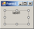
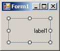
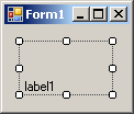
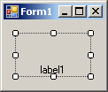
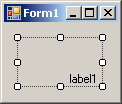
All graphical controls, including the form, can be resized using guiding mouse cursors or the keyboard. To resize a control, first select it. Except for the form, whenever a control is selected, there are eight handles around it. To resize the control, position your mouse on one of the handles. The mouse pointer will change, indicating in what direction you can move to resize the control.
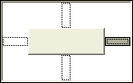
To narrow a control:
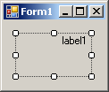
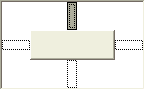
To heighten a control:
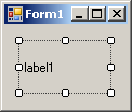
To shrink a control:
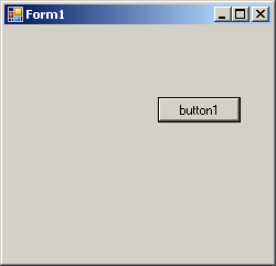
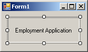
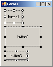
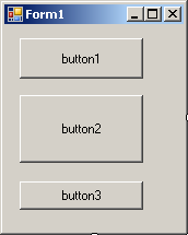
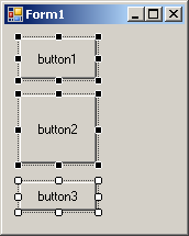
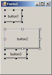
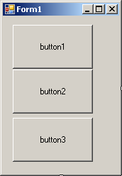
Imagine you have added three controls to your form and, after spending some time designing them, they appear as follows: 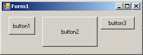 The dimensions of the controls are not set professionally. As seen above, you can resize by dragging their borders but this might take a while if you want them to have the same width, the same height, or both the same height and width. The dimensions of a control or a group of controls are carried by a Size value. At design time, to change the dimensions of a control, first click it. Then, in the Properties window, change the values of its Size property. To change the dimensions of a group of controls, first select them. Then, in the Properties window, change the values of the Size field. The new value would be applied to all selected controls. Alternatively, the Form Designer provides tools to automatically do this for you. To synchronize the widths of a group of controls, first select them. Then, on the Layout toolbar or on the Format group of the main menu, select:
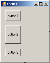
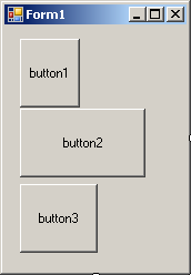
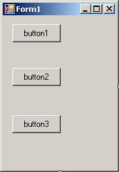
Result: All controls, except for the base control (the control that has the dark handles), will be resized horizontally so they have the same width as the base control:
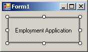
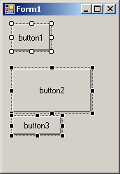
To set the same height to a group of controls, first select them. Then, on the Layout toolbar or on the Format group of the main menu, select:
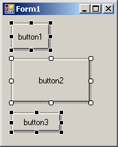
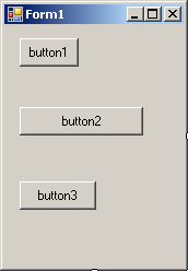
Result: All controls, except for the base control (the control that has the dark handles), will be resized vertically so they have the same height as the base control:
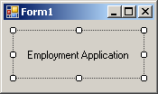
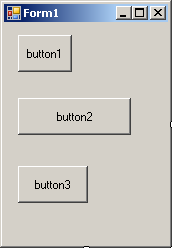
To set the same width and the same height to a group of controls, first select them. Then, on the Layout toolbar or on the Format group of the main menu, select:
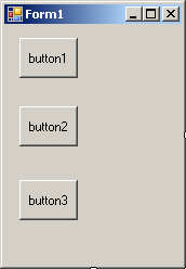
Result: The Form Designer will calculate the sum of the heights of all controls and find their average height (AvgHeight). It will also calculate the sum of the widths of all controls and find their average width (AvgWidth). These averages will be applied to the height and the width respectively of each control:
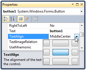
When a control can be resized, or it has been configured to be sizable, as it would be the case for a label or a button, you can specify in what part of its confined borders the text should display. This characteristics is controlled by the TextAlign property. To specify the alignment of text during design, access the Properties window for a control and use the TextAlign field:
The TextAlign property is of type ContentAlignment, which is an enumeration. The members and result of this enumeration are:
To programmatically specify the text alignment of a control, access its TextAlign property and assign it the desired member of the ContentAlignment enumeration. Here is an example: using System;
using System.Drawing;
using System.Windows.Forms;
public class Exercise : Form
{
private Button btnSubmit;
private void InitializeComponent()
{
btnSubmit = new Button();
btnSubmit.Text = "Submit";
btnSubmit.Location = new Point(20, 20);
btnSubmit.Size = new Size(100, 60);
btnSubmit.TextAlign = ContentAlignment.BottomRight;
Controls.Add(btnSubmit);
}
public Exercise()
{
InitializeComponent();
}
}
public class Program
{
static int Main()
{
Application.Run(new Exercise());
return 0;
}
}
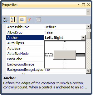
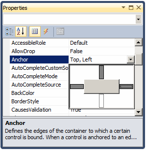
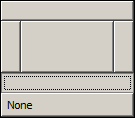
If you position a (visual) control on a form and if the control is positioned on the top left section of the form, when the user resizes the form, the control�s position would appear static, it would not move. This could be a concern if the control is positioned on the right, the bottom or the lower right sections of the form. When the user resizes the form, the control�s position would not be updated. Sometimes you will want the control to have the same location and/or distance with regard to the bottom, the right, and/or the lower right corners of the form. The ability to manage a control or a group of controls' location and size when the user resizes it is done using the Anchor property: 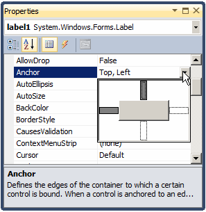 The Anchor property is created from the AnchorStyles enumeration. By default, when you add a control to a form, its position is relative to the top left corner of its container. You can also set the control�s position with regards to its container�s right and bottom borders. The Anchor property can be used to "glue" one border of a control to its parent using one of the following values: Bottom: The control bottom border will be the same even if the parent is heighten or shrunk
Left: The control left border will be the same even if the parent is widened or narrowed
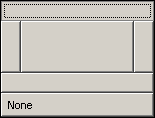
None: No anchoring is applied
Right: The control right border will be the same even if the parent is widened or narrowed
In the same way, you can combine AnchorStyles values to "glue" one or more corners of a control to its parent when the parent is resized:
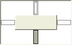
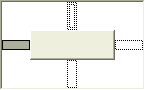
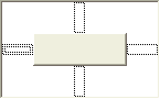
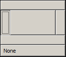
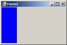
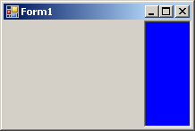
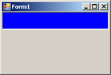
When a control is added to a host, depending on the control, it may be automatically positioned where the mouse landed. In some cases, you will want the control to be attached to a border or to a corner of its parent. This can be done using the Dock property: 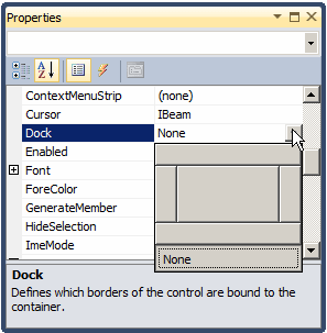 This property is managed through the DockStyle enumeration. To use this property, click the control and, in the Properties window, click the arrow of the Dock field. You can then select one of the following values: Bottom: The control will be attached to the bottom border of its parent:
Fill: The control will use the whole client area of its parent. Left: The control will be attached to the left border of its parent:
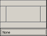
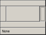
None: The control will be kept where it was positioned on the parent:
Right: The control will be attached to the right border of its parent:
Top: The control will be attached to the top border of its parent:
To programmatically specify the docking option of a control, access its Dock property and assign the desired member of the DockStyle enumeration. Here is an example: public class Exercise : Form
{
private Button btnSubmit;
private void InitializeComponent()
{
btnSubmit = new Button();
btnSubmit.Text = "Submit";
btnSubmit.Dock = DockStyle.Right;
Controls.Add(btnSubmit);
}
}
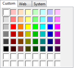
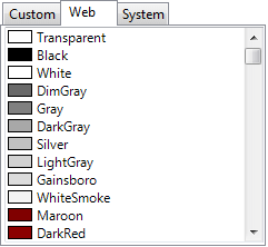
Controls used on Microsoft Windows are painted using a color known as Control. If you don't like the default color that paints the background of a control, you can access the BackColor field of the Properties window: 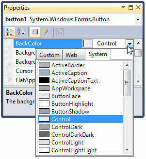 You can then select one of the preset colors from 3 windows represented with tabs:
As you can see, the System and the Web tabs provide colors by name. All regular names of colors of the English language are represented. If you have done Windows programming before, you may recognize the names of colors in the System tab because they are the same names you would see in Control Panel, except that the names are in one word. If you have done web development before, you may recognize the names because they are the same defined by Netscape. The names in both the System and the Web tabs are defined in an enumeration called Color. If you are not familiar with the names of colors, you can visually select a color in the Custom tab. To programmatically specify the background color of a control, access its BackColor property and assign it the desired member of the Color enumeration. Here is an example: public class Exercise : Form
{
private Button btnSubmit;
private void InitializeComponent()
{
btnSubmit = new Button();
btnSubmit.Text = "Submit";
btnSubmit.BackColor = Color.Aquamarine;
Controls.Add(btnSubmit);
}
}
Instead of a color, you may want to fill the control with a picture. To do this, you can access the control's BackgroundImage property. This provides an ellipsis button you can use to locate and select the desired picture. Some controls display a border when they are drawn and some others don't. Consider the following:
Some of these controls allow you to specify a type of border you want to show surrounding the controls. This characteristic is controlled by the BorderStyle property, which is based on BorderStyle enumerator. Its members are:
To programmatically specify the border style of a control, access its BorderStyle property and assign it the desired BorderStyle member. Here is an example: using System;
using System.Drawing;
using System.Windows.Forms;
public class Exercise : Form
{
private Panel pnlViewer;
private void InitializeComponent()
{
pnlViewer = new Panel();
pnlViewer.BorderStyle = BorderStyle.Fixed3D;
pnlViewer.BackColor = Color.LightBlue;
Controls.Add(pnlViewer);
}
public Exercise()
{
InitializeComponent();
}
}
public class Program
{
static int Main()
{
Application.Run(new Exercise());
return 0;
}
}
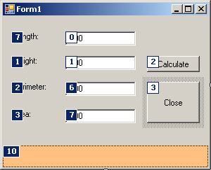
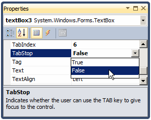
A user can navigate through controls using the Tab key. When that key has been pressed, the focus moves from one control to the next. By their designs, not all controls can receive focus and not all controls can participate in tab navigation. Even controls that can receive focus must be primarily included in the tab sequence. At design time, the participation to tab sequencing is controlled by the Boolean TabStop property in the Properties window. Every visual control that can receive focus is already configured to have this property set to True. If you want to remove a control from this sequence, set its TabStop value to False. If a control has the TabStop property set to True, to arrange the navigation order of controls, you have two main options. At design time, you can click a control on the form. Then, on the Properties window, change the value of its TabIndex field. The value must be a positive short integer. The best and easiest way to arrange the tab sequence of controls is to manage it visually. To do this, first display the form. Then, on the main menu, click View. This causes a number to be positioned on every control of the form. Here is an example: 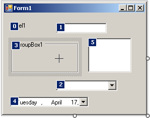 To arrange the sequence any way you like, click each control once in the desired order. Normally, static controls (such as the label, the picture box, the panel, etc) never receive focus when the application is running; therefore, you can skip such controls.
A control is referred to as visible if it can be visually located on the screen. A user can use a control only if he or she can see it. As a programmer, you have the role of deciding whether a control must be seen or not and when. The visibility of an object is controlled by the its Visible property. This is a Boolean property. At design time, when you add a control to a parent, it is visible by default. This is because its Visible property is set to True in the Properties window. In the same way, if you programmatically create a control, by default, it is made visible once you add it to its parent's Controls property. If you don't want a control to primarily appear when the form comes up, you can either set its Visible property to False or set its parent�s visible property to False. Equivalently, at run time, to hide a control, assign a False value to either its Visible property or its parent�s Visible property. Keep in mind that when a parent gets hidden, it also hides its children. On the other hand, a parent can be made visible but hide one or some of its children. To programmatically check whether a control is visible at one time, apply a conditional statement (if or while) to its Visible property and check whether its value is true or false.
For the user to use a control, it must allow operations on it. For example, if a control is supposed to receive text, the user can enter characters in it only if this is made possible. To make a control available to the user, the object must be enabled. The availability of an object is controlled by the Boolean Enabled property. By default, after adding a control to a form, it is enabled and its Enabled property in the Properties window is set to True. An enabled control displays its text or other characteristics in their normal settings. If you want to disable a control, set its Enabled property to False. In the following picture, a text box and a button are disabled: 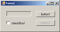 To programmatically find out whether a control is enabled or not, check its Enabled property. Drag n' drop is the ability to drag an object or text from one location or object to another. This is a significant operation in computer use. Although Microsoft Windows fully supports drag n' drop operations, because the operating system cannot predict how the operations should be carried, you must write code. Various controls support drag n' drop operations. While most controls support them, it is not always realistic to implement the operations on every control. This means that you will have to decide when, how, and what controls of your application will need to allow the user do drag what and drop it where. A control that allows drag n' drop operations is equipped with a Boolean property named AllowDrop. When you set this property to true, it means the user can either drag something from it or drop something on it. After setting this property, you must write code. We will see examples in future lessons.
A method is a procedure created as a member of a class. Methods are used to access or manipulate the characteristics of an object or a variable. There are mainly two categories of methods you will use in your classes:
As you know from your study of the C# language, every class has a fundamental method called a default constructor. Every control of the .NET Framework is based on a class that has a default constructor and most of those classes have only one constructor: the default. The default constructor allows you to instantiate the class without necessarily initializing it. To use it, you must know the name of the control you want to use since each control bears the same name as its class. Here is an example: using System;
using System.Windows.Forms;
public class Exercise : System.Windows.Forms.Form
{
private Button btnReset;
public Exercise()
{
InitializeComponent();
}
#region Section Used to Initialize Controls
private void InitializeComponent()
{
btnReset = new Button();
}
#endregion
static void Main()
{
Application.Run(new Exercise());
}
}
If you are not planning to use a control straight from the .NET Framework, you can also create your own class that is derived from the class of the control, as we have mentioned in previous lessons. As mentioned in the previous lesson, after instantiating a control, it is available but the user cannot see. Each control that acts as a parent of another control has a property called Controls. This property, which is a ControlCollection type, is equipped with an Add() method. If you want to display the new control to the user, you should pass it to the Control.Controls.Add() method. Here is an example: using System;
using System.Windows.Forms;
public class Exercise : System.Windows.Forms.Form
{
private Button btnReset;
public Exercise()
{
InitializeComponent();
}
#region Section Used to Initialize Controls
private void InitializeComponent()
{
btnReset = new Button();
Controls.Add(btnReset);
}
#endregion
static void Main()
{
Application.Run(new Exercise());
}
}
This displays the control to the user. After using a control, it must be destroyed. In C++, this is traditionally done using the delete operator in the destructor of the parent of all controls, which could be a form. Another detail of Windows controls is that they use or consume computer resources during their lifetime. When the controls are not used anymore, such as when their application closes, these resources should be freed and given back to the operating system to make them available to other controls. This task can be performed using the Dispose() method to the Control class, which can then be overridden by its child controls. The syntax of the Control.Dispose() method is: protected override void Dispose(bool disposing); This method takes one argument, disposing, that indicates how the resources would be released. If this argument is passed with a false value, only the unmanaged resources would be released. If it is passed as true, then both managed and unmanaged resources would be released.
In the previous lesson, we saw that you can call the Visible property to hide a visible control or to display a hidden control. Besides the Visible property, you can also display a control using the Show() method. Its syntax is: Public Sub Show() When you use this method, if the control is visible, nothing would happen. If it were hidden, then it would be revealed. In the following example, a text box named textBox1 is asked to display: private void button1_Click(object sender, EventArgs e)
{
this.textBox1.Visible = false;
}
private void button2_Click(object sender, EventArgs e)
{
this.textBox1.Show();
}
The Show() method internally sets the Visible property to true. We also saw that, to hide a control, you can set its Visible property to False. In the same way, to hide a control, you call can the Control.Hide() method. Its syntax is: Public Sub Hide() In the following example, the visibility of a text box named textBox1 is toggled by the user clicks a button named button1: private void button1_Click(object sender, EventArgs e)
{
if( this.textBox1.Visible == true )
this.textBox1.Hide();
else
this.textBox1.Show();
}
Keep in mind that hiding a control does not close or destroy it.
Once a control is visible, the user can use it. Some controls allow the user only to read their text or view what they display. Some other controls allow the user to retrieve their value or to change it. To perform such operations, the user must first give focus to the control. The focus is a visual aspect that indicates that a control is ready to receive input from the user. Various controls have different ways of expressing that they have received focus. Button-based controls indicate that they have focus by drawing a thick border and a dotted rectangle around their caption. In the following picture, the button on the right has focus: 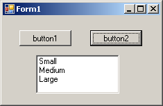 A text-based control indicates that it has focus by displaying a blinking cursor. A list-based control indicates that it has focus when one of its items has a surrounding dotted rectangle:  To give focus to a control, the user can press a key such as Tab. To programmatically give focus to a control, call the Focus() method. Here is an example: private void button2_Click(object sender, EventArgs e)
{
this.textBox1.Focus();
}
In the previous lesson, we saw how you can position controls visually or manually. In some cases, you end up with one control positioned on top of another. Of course the first remedy that comes in mind would consist of moving one of the controls away from the other. This would also imply sometimes that you would have to enlarge and/or heighten the controls' container. There are situations that either you don't want to resize the parent or you can't: your only solution is to have one control on top of another. Fortunately, you can cope with this situation by specifying, when needed, what control at what time should be displayed to the user. When one control is positioned on top of another, they use a third axis whose origin, like that or the other axes, is on the top-left corner of the parent. This third axis, also considered the z-axis, is oriented so that it moves from the monitor towards the user. The operating system is in charge of positioning and drawing the objects on the screen. You as the programmer can direct the operating system as to what object should be on top and what object should be behind. To support these changes the Control class uses two methods that its appropriate children derive also. When a control A is positioned behind a control be, this causes control be either partially or completely hidden. If you want the control A to change its z-order and become on top of control B, you can call its BringToFront() method. The syntax of this method is: public void BringToFront(); On the other hand, if a control B is positioned on top of a control A, if you want control B to become positioned behind control A, you can call control B's SendToBack() method. Its syntax is: public void SendToBack(); After the controls have been positioned, at any time, when you access a control, if you want to know whether that control is the most top object, you can call its GetTopLevel() method. Its syntax is: proteced bool GetTopLevel();
The Windows controls available from the .NET Framework and that we will user throughout this site are fully functional. They are equipped with various methods ready to be used. Of course, no library can surely provide every single type of method that every programmer would use. For this reason, it will not be unusual that you need a method that is not available for a control you are using. In the same way, when you create a Windows Application that is based on a Form class, you will likely need a method that is not defined in the Form class. In this case, you can create your own and new method. A method is created like a normal procedure. If you want to add it to a form, you can open the Code Editor and write your procedure outside of any existing procedure. Here is an example: /// <summary>
/// The main entry point for the application.
/// </summary>
[STAThread]
static void Main()
{
Application.Run(new Form1());
}
double CalculateRectangleArea(Rectangle Recto)
{
return Recto.Width * Recto.Height;
}
}
}
In the same way, if you derive a class from one of the existing classes because you want to get a custom control from it, you can declare a new method as you see fit and use it appropriately. Probably the best way is to let the Code Editor insert the new method based on your specifications. To do that, in the Class View, first expand the name of the project. Then, right-click the name of the class where you want to add a new method, position the mouse on Add, and click Add Method. This would open the C# Method Wizard dialog box you can fill out and click Finish. After the method's body has been defined you
|
||||||||||||||||||||||||||||||||||||||||||||||||||||||||||||||||||||||||||||||||||||||||||||||||||||||||||||||||||||||||||||||||||||||||||||||||||||||||||||||||||||||||||||||||||||||||||||||||||||||||||||||||


 Application:
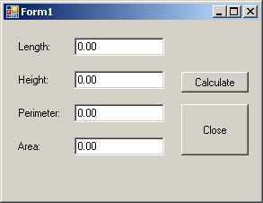
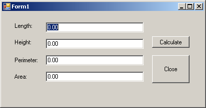
Setting the Locations and Sizes of Controls
Application:
Setting the Locations and Sizes of Controls