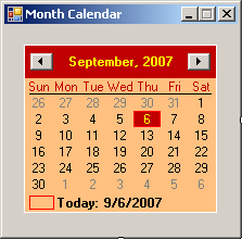
Under the title bar, the short names of week days display, using the format set in the Windows Control Panel. In US English, the first day is usually Sun for Sunday. The first day can be changed by the programmer. On the control, the currently selected date is highlighted. In the main area, the numeric days of the month display on a white background (this color and any color on the control can be changed). To select a date, the user can click it in the list. By default, the calendar opens with today's day highlighted. Using the buttons of the title bar, the month-year label, the user can change the date. If at one time the month calendar is displaying a date other than today, and if the user wants to return to today's date, he or she can:
 If the month calendar displays regularly (with a month, a year, the week days, and the days of a month), if the user clicks the label that is between the buttons, the month calendar displays a list of 12 months from January to December, and the month of the date that was previously selected is highlighted. Here is an example: 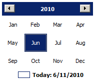 If the month calendar is displaying a list of months:
If the month calendar is displaying the names of months and if the user clicks the year, the label would display a decade of the current year and the 9th year from it. The body of the month calendar would display the years in that decade, plus the year prior to that decade and the year after that decade: 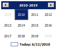 That display has new options:
If the month calendar is displaying the numbers of 12 years and if the user clicks the label, the label would display a century from the current year and the 99th year from it. The body of the month calendar would display 12 labels that each shows a decade: 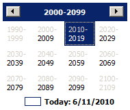 This time:
The calendar can be configured to display more than one month. You have many options. You can display the months horizontally: 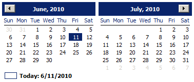 Or you can display them vertically: 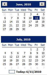 If the control is displaying more than one month, the buttons would increment or decrement by the previous or next value (month, year, decade, or century) in the list. For example, if the control is displaying April and May and if the user clicks the left button, the control would display March and April. If the control is displaying April and May and if the user clicks the right button, the control would display May and June.
The month calendar control is based on the
MonthCalendar class, which is based on the Control class. To
visually create a month calendar control, you can click the MonthCalendar
button
using System;
using System.Drawing;
using System.Windows.Forms;

public class Exercise : System.Windows.Forms.Form
{
    MonthCalendar mcExercise;

    public Exercise()
    {
        InitializeComponent();
    }

    void InitializeComponent()
    {
        mcExercise = new MonthCalendar();

        Controls.Add(mcExercise);
        Text = "Month Calendar";
    }
}

public class Program
{
    static int Main()
    {
        System.Windows.Forms.Application.Run(new Exercise());
        return 0;
    }
}
A month calendar is primarily a Windows control. It gets it primary properties from the Control class. Based on this, when creating it, you can specify its location, its size, and other characteristics. When the user clicks the month calendar, one date is selected. As mentioned in our description, you can give the control the ability to display more than one month. To make this possible, when visually creating the control, set its width to have enough space. In the same way, you can increase the height to display many months. This allows you to display as many months as you judge necessary. Here is an example: 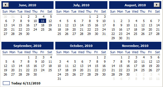 To make it a highly visual object, the month calendar uses different colors to represent the background, week days, the background of the title bar, the text of the title bar, the text of the days of the previous month, and the text of the days of the next month. To visually control the colors, access the Properties window for the month calendar.
As mentioned in our description, the calendar control displays the days of a selected month. The control also displays the remaining days, if any, of the first week of the currently selected month; that is, the days of the previous month that share the week with the first day of the first week of the selected month. The control also displays the first days of the subsequent month that share the week with the last day of the current month. To use the calendar control, the user can click a date, whether it a date from the current month or a day of the other (previous and next) month. When the user has clicked a date to select it, the control fires a DateSelected event. The DateSelected event is of type DateRangeEventArgs. The user can also select a date using the keyboard. To do this, the user must first give focus to the control. This is possible by pressing Tab continuously until the control receives focus (or by clicking any date on the control). To select a date using the keyboard, the user can continually press one of the arrow keys (on the keyboard) until the desired date is selected. You too can programmatically select a date on the calendar control. To do this, assign a valid DateTime value to both the SelectionStart and the SelectionEnd properties. Here is an example: using System;
using System.Drawing;
using System.Windows.Forms;
public class Exercise : System.Windows.Forms.Form
{
Button btnSelectDate;
MonthCalendar mcExercise;
public Exercise()
{
InitializeComponent();
}
void InitializeComponent()
{
btnSelectDate = new Button();
btnSelectDate.Location = new Point(12, 12);
btnSelectDate.Text = "Select Date";
btnSelectDate.Click += new EventHandler(btnSelectDateClicked);
mcExercise = new MonthCalendar();
mcExercise.Location = new Point(12, 44);
Controls.Add(btnSelectDate);
Controls.Add(mcExercise);
Text = "Month Calendar";
}
void btnSelectDateClicked(object sender, EventArgs e)
{
mcExercise.SelectionStart = new DateTime(1988, 12, 5);
mcExercise.SelectionEnd = new DateTime(1988, 12, 5);
}
}
public class Program
{
static int Main()
{
System.Windows.Forms.Application.Run(new Exercise());
return 0;
}
}
When a date has been selected, whether by the user (using the mouse or the keyboard) or by you (through code), the control fires a DateChanged event. The DateChanged event is of type DateRangeEventArgs. The DateRangeEventArgs class is equipped with two properties: Start and End. When the user clicks a date, these two properties hold the date that was clicked. This means that you can use either of these properties to know the date that was clicked. Both the Start and the End properties are of type DateTime.
When the user clicks the calendar control, one date is selected. As mentioned in our description, you can give the control the ability to display more than one month. To make this possible, when creating the control, set its width to have enough space. In the same way, you can increase the height to display many months. To select more than one date, the user can click one date, hold the mouse down, and drag to the left, the right, up or down: 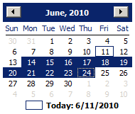 The user can also select a range of dates using the keyboard or using a combination of the mouse and the keyboard. To do this, the user must first give focus to the control. To select a range of dates using the keyboard, the user can press and hold Shift, then press one of the arrow keys continually until the last date of the desired range is selected (in reality, we will see that there is a property that controls the maximum range of dates that can be selected). To select a range of dates using a combination of the mouse and keyboard, the user can click the first date, press and hold Shift, then click the last date. After selecting the days, the starting date is stored in the SelectionStart property. The last date of the selection is stored in the SelectionEnd property. Both properties are of DateTime type. The range of the selected dates is stored in a SelectionRange value. SelectionRange is simply a class that can give you information about the beginning and the end of a selected range of dates. To programmatically select a date, assign the starting to the SelectionStart property and assign the last date to the SelectionEnd property. By default, the user can select only up to 7 days at a time. If you want, you can let the user be able to select more or less days than that. If you configure the control to display more than one month, the user can select days from one month to another as long as the days are in a range. After selecting a range of dates, the control fires a DateChanged event, which is of type DateRangeEventArgs. We saw earlier that the DateRangeEventArgs class has two properties. The DateRangeEventArgs.Start property holds the starting date of the range that the user made. The DateRangeEventArgs.End holds the last date from the range that the user made.
To control the number of days you want the user to be able to select, change the value of the MaxSelectionCount property. The user cannot select more days than the MaxSelectionCount value but the user can select less.
The calendar control is a rectangular object without a border. After placing it on the form, it displays the current month and only one month. This is because, by default, its width and height are set enough to accommodate only one month. To make it a highly visual object, a month calendar control uses different colors to represent the background, week days, the background of the title bar, the text of the title bar, the text of the days of the previous month, and the text of the days of the next month. To visually change a color, you can click its field in the Properties window, and:
To programmatically change a color, access its property name in code and assign the desired , whether by name or using its RGB value.
As mentioned already, the top section of the calendar control displays buttons and labels. By default, these are positioned on top of a blue background. The background color of this section is controlled by the TitleBackColor property. Here is an example of changing it: using System;
using System.Drawing;
using System.Windows.Forms;
public class Exercise : System.Windows.Forms.Form
{
MonthCalendar mcExercise;
public Exercise()
{
InitializeComponent();
}
void InitializeComponent()
{
mcExercise = new MonthCalendar();
mcExercise.Location = new Point(12, 12);
mcExercise.TitleBackColor = Color.FromArgb(192, 0, 0);
Controls.Add(mcExercise);
Text = "Month Calendar";
}
}
public class Program
{
static int Main()
{
System.Windows.Forms.Application.Run(new Exercise());
return 0;
}
}
By default, the labels on the title bar display in a white color defined by the ActiveCaptionText system color. The color used to paint the text of the labels of the title bar is controlled by the TitleForeColor property. Here is an example of changing it: void InitializeComponent()
{
mcExercise = new MonthCalendar();
mcExercise.Location = new Point(12, 12);
mcExercise.TitleBackColor = Color.FromArgb(192, 0, 0);
mcExercise.TitleForeColor = Color.Yellow;
Controls.Add(mcExercise);
Text = "Month Calendar";
}
As mentioned already, to change month and subsequently the year of the calendar, the user can click the buttons continuously. By default, the user can navigate from 1/1/1753 to 12/31/9998. If you want to limit the allowable dates beyond which the user should not navigate, use the MinDate and the MaxDate properties.
Under the title bar, the short names weekdays display, using the format set in Control Panel. In US English, the first day is usually Sunday. If you want to start with a different day, set the value using the FirstDayOfWeek property. The names of weekdays use the same color as the TitleBackColor property. Under the names of the week, there is a horizontal line used as the separator. By default, this line separator is painted in black but it uses the same color as the numeric values of the days of the selected month.
Besides the days of the currently selected month, the calendar control also displays one or more days of the previous month and one or more days of the subsequent month. These are referred to as trailing months or trailing days. These are dayts that don't belong to the currently selected month. These days display in a different color controlled by the TrailingForeColor property. By default, this color is set to GrayText:
Of course, you can programmatically change these colors. Although any color is allowed in any category, you should make sure that the calendar is still reasonably appealing and usable.
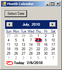
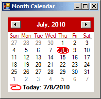
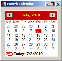
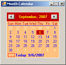
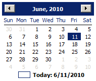
The calendar control is used to let the user know today's date in two ways. On the calendar, today's date is circled by an almost hand-drawn ellipse. In the bottom section of the calendar, today's date is also displayed as a sentence. If you want to display or hide the bottom label, set the ShowToday Boolean property accordingly. For example, to hide it, set this property to false. The presence or absence of this ellipse is controlled by the ShowTodayCircle Boolean property whose default value is True. If you set this property to False, today's would appear without the ellipse:  When a new calendar control is added to an application, it assumes today's date. If you want to change this date, use the TodayDate property.
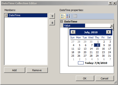
To accentuate the importance of one or more days of a month, you can bold some days. To bold some days of the month calendar, create an array that holds the days. To visually create the list of dates, on the form, click the calendar control. In the Properties window, click BoldDates and click the ellipsis of its field. This would open the DateTime Collection Editor. To add a date member, you can click Add. On the right side, there would be a field named Date. You can type the date or you can click the arrow of the field. This would display a calendar:
You can then select a date. In the same way, to complete the array, you can create the other dates you want. After creating the list, you can click OK. To programmatically create the list of dates, create an array of DateTime values (each member of the array must be a recognizable DateTime value). Once the array is ready, assign it to the BoldDates property. If you prefer the months bolded, assign the array to the MonthlyBoldedDates property.
|
||||||||||||||||||||||||||||||||||||||||||||||||||||||||||||||||||||||||||||||||||||||||||||||||||||||||||||||||||||||||||||||||||||||||||||||||||||||||||||||||||||||||||||||||||||||||||||||||||||||||||||||||||||||||||||||||||||||||||||||||||||||||||||||||||||||||||||||||||||||||||||||||||||||||||||||||||||
 Application:
Introducing the Month Calendar Control
Application:
Introducing the Month Calendar Control in the Toolbox and click the form or the desired container. To
programmatically create a month calendar, declare a variable or type
MonthCalendar and add it to the Controls collection of its container.
Here is an example:
in the Toolbox and click the form or the desired container. To
programmatically create a month calendar, declare a variable or type
MonthCalendar and add it to the Controls collection of its container.
Here is an example: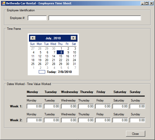