As a member of the family of control containers, a panel can be used to hold or carry controls placed on it. When a panel moves, it does so with the controls placed on it. When a panel is visible, the controls placed on it can be visible too, unless they have their own visibility removed. When a panel is hidden, its child controls are hidden too, regardless of their own visibility status. This property also applies to the panel's availability. Panels are not transparent. Therefore, their color can be changed to control their background display. A panel is a complete control with properties, methods, and events.
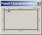
To add a panel to a container, you can click the Panel
button
To programmatically create a panel, declare a handle to Panel, allocate memory for it using the new operator, and add it to its parent. Here is an example: using System;
using System.Drawing;
using System.Windows.Forms;
public class Exercise : System.Windows.Forms.Form
{
Panel pnlContainer;
public Exercise()
{
InitializeComponent();
}
private void InitializeComponent()
{
Text = "Domain Configuration";
Width = 320;
Height = 210;
Location = System.Drawing.Point(140, 100);
StartPosition = FormStartPosition.CenterScreen;
pnlContainer = new Panel();
pnlContainer.Location = Point(20, 20);
pnlContainer.Size = System.Drawing.Size(100, 60);
Controls.Add(pnlContainer);
}
}
public class Program
{
static int Main()
{
System.Windows.Forms.Application.Run(new Exercise());
return 0;
}
}
As stated already, a panel is an object created from the Panel class. This class is derived from the ScrollableControl class where it gets its primary characteristics. The ScrollableControl class itself is derived from the Control class. Based on this, a property that is highly used on panels (and forms) is the Color. If you change the BackColor property, the new color would cover the face of the panel.
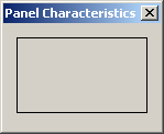
By default, a panel object is drawn without borders. If you want to add borders to it, use the BorderStyle property. It provides three values that you can set in the Properties window: None, FixedSingle, and Fixed3D and their effects are as follows:
To programmatically specify the border style, assign the desired value to the Panel.BorderStyle property. Here is an example: private void InitializeComponent()
{
Text = "Domain Configuration";
Width = 320;
Height = 210;
Location = System.Drawing.Point(140, 100);
StartPosition = FormStartPosition.CenterScreen;
pnlContainer = new Panel();
pnlContainer.Location = Point(20, 20);
pnlContainer.Size = System.Drawing.Size(100, 60);
pnlContainer.BorderStyle = BorderStyle.Fixed3D;
Controls.Add(pnlContainer);
}
A panel can be used as a button, in which case the user would click it to initiate an action.
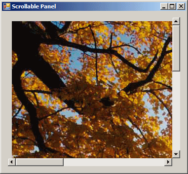
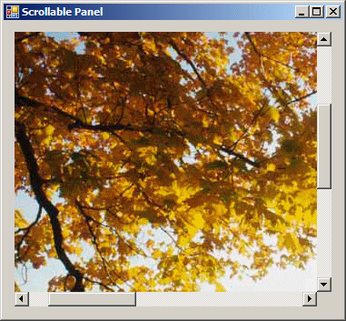
A panel is one of the best control containers you can use. Besides aesthetic characteristics, the panel provides the ability to scroll, vertically and/or horizontally on its body. Scrolling makes it possible to give the user access to hidden parts that go beyond the (visible) client area of the panel. Here is an example:
To assist you with scroll bars, the Panel class is equipped with a property named AutoScroll. In reality, this property is inherited from the ScrollableControl class. If you want a ScrollableControl-based control to display the scroll bars, set this property to true. The steps to have the scroll bars on a panel are:
One of the properties that influences the behavior of scroll bars is AutoScrollMargin. This property controls the area inside of which the scrolling can occur. This property is of type Size, which means it holds the width and the height of the scrollable area. Its default value is (0, 0), which means the whole client area of the parent will be used. If you to limit the area, change the value of this property.
|
|||||||||||||||||||||||||||||||||||||||||||
 from the Toolbox and click the desired location on the container. Unlike the
form, during design, a panel must primarily be positioned on another
container which would be a form or another panel.
from the Toolbox and click the desired location on the container. Unlike the
form, during design, a panel must primarily be positioned on another
container which would be a form or another panel.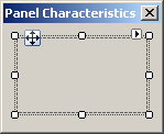
 to the above panel (so that the panel is its parent). You should
manually align it to the left of its container so that the top-left
corner of the panel coincides with the top-left corner of the panel. Set
this picture box's Dock property to None. Set its
SizeMode to AutoSize. If you (and most of the time you will)
want to programmatically handle the picture box, give it a recognizable
name that you can refer to in your code
to the above panel (so that the panel is its parent). You should
manually align it to the left of its container so that the top-left
corner of the panel coincides with the top-left corner of the panel. Set
this picture box's Dock property to None. Set its
SizeMode to AutoSize. If you (and most of the time you will)
want to programmatically handle the picture box, give it a recognizable
name that you can refer to in your code