
The Integrated Development Environment
 |
The Integrated Development Environment |
Application programming primarily consists of populating a form with objects called Windows controls. These controls are what the users of your application use to interact with the computer. As the application developer, one of your jobs will consist of selecting the necessary objects, adding them to your application, and then configuring their behavior. Just mentioned with the form, there are various ways you can get a control into your application. One of the techniques consists of programmatically adding a control by writing code. Another technique consists of visually selecting a control and adding it to a form. To create your applications, there are two settings you will be using. If a control is displaying on the screen and you are designing it, this is referred to as Design Time. This means that you have the ability to manipulate the control. You can visually set the control’s appearance, its location, its size, and other necessary or available characteristics. The design view is usually the most used and the easiest because you can glance at a control, have a realistic display of the control and configure its properties. The visual design is the technique that allows you to visually add a control and manipulate its display. This is the most common, the most regularly used, and the easiest technique. The other technique you will be using to control a window is with code, writing the program. This is done by typing commands or instructions using the keyboard. This is considered, or referred to, as Run Time. This is the only way you can control an object’s behavior while the user is interacting with the computer and your program.
When creating your applications, you will use a set of windows
that each accomplishes a specific purpose. Some windows are represented with an
icon but hides the rest of the body. For example, by default, on the left of the
screen, you may see an icon made of two computers
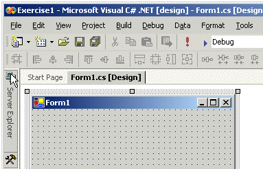 If you expand a window, it would display a title bar with two buttons. One is called Auto Hide and the other is the classic Close button: 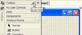 If you expand a window but find out you don't need it any more, you can just move the mouse away from it. The window would return to its previous state. Based on this functionality, if you are working with a window and move the mouse away from it, it would retract. If you need it again, you would have to reopen it using the same technique. If you are going to work with a certain window for a while, you can keep it open even if you move the mouse away. To do this, click the Auto Hide button. If clicked, the Auto Hide button changes from pointing left to pointing down. When Visual Studio opens, it make some windows necessary. These are the most regularly used windows. If you think that one of them is not regularly used in your types of assignments, you can remove it from the screen by clicking its Close button. All of the windows you can use are listed in the View menu. Therefore, if a window is not displaying, you can click View on the main menu and click a window of your choice. By its default installation, Visual Studio installs some windows to the left and some others to the right of the screen. You can change this arrangement if you want. To do this, expand a window, then drag its title bar to another location on the screen. Windows can then be "coupled", that is docked together to one side of the screen. When windows are grouped, they automatically create tabs, allowing you to select the desired one by clicking its tab. The options available in windows display differently depending on the window and the items in it. Some item are organized in a tree list equipped with + or – buttons. To expand a list, you can click its + button. To collapse a list, click its – sign. Some other items appear as button.
A Windows control is a graphical object that allows the user to interact with the computer. The controls are as varied as the needs and goals are. Because there are so many controls for various purposes, their insertion to an application and their configuration are left to the computer programmer. The Toolbox is the accessory that provides most of the controls used in an application. By default, the Toolbox is positioned on the left side of the IDE. To change that position, you can drag its title bar away and dock it to another side of the ID. The Toolbox also uses a default width to show the items on it. If the width is too small or too large for you, you can change it. To do this, position the mouse to its right border and drag left or right.
When you start a Windows Application, it provides various controls on the Toolbox so you can choose which ones are appropriate for your particular application. Controls can be set by categories based on their function or role. A container is a control whose main purpose is to host other controls. To design it, you pick up objects from the Toolbox and drop them where desired. The Toolbox organizes its items in categories and each category is represented by a button: 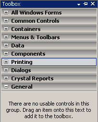 If the available list of categories is not enough, you can add a new section of your choice. By default, Visual Studio hides some categories because they are judged hardly used. To display these additional sections, you can right-click anywhere in the Toolbox and click Show All Tabs: 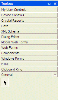 If you still want an additional tab not included in the list, you can add one (or more). To do that, right-click anywhere in the Toolbox and click Add Tab. You would be prompted to provide a name. After typing the new name, press Enter.
To use an object of a particular category, you can first click its button. After selecting a category, it displays its items. In each category, a particular button called Pointer is selected by default. This simply indicates that no item in the group is currently selected. By default, the items in each category are organized as horizontal wide buttons: 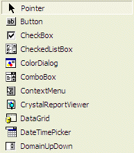 Alternatively, you can list the items of a category as buttons of a list view. To do that, you can right-click anywhere in the category and click List View to remove its check box: 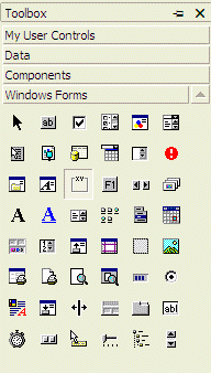
When Microsoft Visual Studio is installed, it adds the buttons in a somewhat random order: 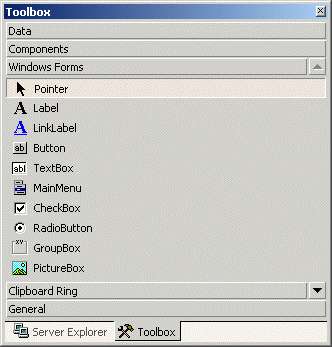 In the beginning, this can make it difficult to find a particular control when you need it. If you find it more convenient, you can arrange the list of controls in any order of your choice. You have two main options. To change the position of an item in the list, right-click it and click either Move Up or Move Down. Alternatively, you can arrange the items in alphabetic order. To do that, right-click anywhere in the Windows Forms section and click Sort Items Alphabetically: 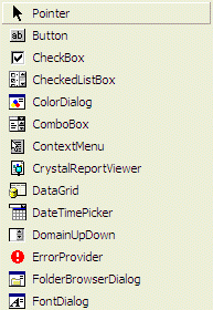 Once you have rearranged items alphabetically, the Toolbox forgets the previous arrangement and you cannot restore it. Alternatively, you can right-click the button of a control and click either Move Up or Move Down.
To add a control to your application, you can select it from the Toolbox and click the desired area on the form. Once added, the control is positioned where your mouse landed. In the same way, you can add other controls as you judge them necessary for your application. Here is an example of a few controls added to a form: 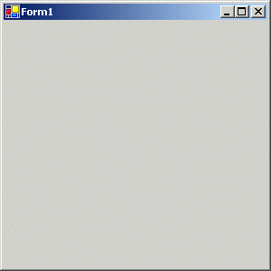 Alternatively, to add a control, you can also double-click it from the Toolbox and it would be added to the top-left section of the form. If you want to add a certain control many many times, before selecting it on the Toolbox, press and hold Ctrl. Then click it in the Toolbox. This permanently selects the control. Every time you click the form, the control would be added. Once you have added the desired number of this control, on the Toolbox, click the Pointer button to dismiss the control.
There are two main ways you will manipulate an object of your application, visually or using code. In the next lessons, we will explore details of visually designing a control. As you should have found out from learning C#, code of an application is ASCII text-based, written in plain English and understandable to human eyes. For a Visual C# application, you can use any text editor to write your code but one of Visual Studio's main strengths is the code editor that it has always brought. It is so intuitive you would think that it can think. The Code Editor is a window specially designed for code writing.
To display the code editor, if you create an empty project, you can click Project on the main menu and select one of the options that would lead either to a blank text file or a a file that contains primary code. The Code Editor of Visual C# is divided in 4 sections: 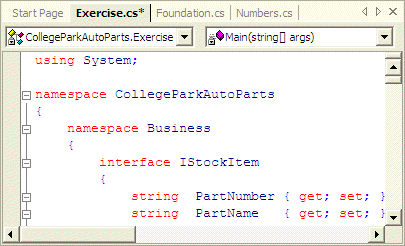
The top section of the Code Editor displays tabs of property pages. Each tab represents a file that contains code. To add a new file to the project, on the main menu, you can click
Once in the Add New Item dialog box, in the Templates section, click Code File, type a name in the Name text box, and press Enter. After a file has been created, it is represented by a tab in the top section of the Code Editor. In the same way, you can add as many files as you judge them necessary. To access one of theses files, you can click its corresponding tab. By default, the tabs display in the order their files were created or added to the project, from left to right. If you don't like that arrangement, click and drag its tab either left or right beyond the next tab: 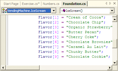
The top-left section of the Code Editor displays a combo box named Types. As its name indicates, the Types combo box holds a list of the types as classes and structures that are used in the current project. You can display the list if you click the arrow of the combo box:  Each item of the Types combo box displays the name of its type associated with its parent as implemented in the code. The parent can be a class or a namespace. If you select a class in the list, the Code Editor jumps to that class and positions the caret at the beginning of the class' definition.
The top-right section of the Code Editor displays a combo box named Members. The Members combo box holds a list of the members of classes. The content of the Members combo box depends on the item that is currently selected in the Types combo box. This means that, before accessing the members of a particular class, you must first select that class in the Types combo box. Then, when you click the arrow of the Members combo box, the members of only that class display:  If you select an item from the Members combo box, the Code Editor jumps to that members and positions the cursor to the left of the member.
Code is written in a wide area with a white background that is actually referred to as the code editor. This is the area you use the keyboard to insert code with common readable characters. If you insert a new file using the Code File option of the Add New Item dialog box, the file is created empty, waiting for your code. If you add code through the Add Class option, some primary lines of code would be inserted in the file.
To manage its code, the Code Editor uses some techniques to display its code. Colors are used to differentiate categories of words or lines of text:  The colors used are highly customizable. To change the colors, on the main menu, you can click Tools -> Options... In the Options dialog box, in the Environment section, click Fonts and Colors. To set the color of a category, in the Display Items section, click the category. In the Item Foreground combo box, select the desired color. If you want the words of the category to have a colored background, click the arrow of the Item Background combo box and select one: 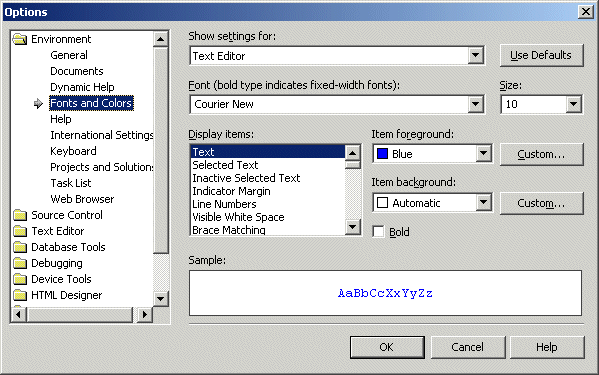 In both cases, the combo boxes display a fixed list of colors. If you want more colors, you can click a Custom button to display the Color dialog box that allows you to "create" a color.
When code of a file is long, it can be tiresome to scroll up and down. The Visual Studio .NET's Code Editor allows you to create sections that allow the code to behave like the tree arrangement of the left pane of Windows Explorer. This means that you can expand or collapse section of code. The Code Editor supports this feature automatically by adding + buttons at the beginning of the lines of sections that can be expanded or collapsed. This is the case for namespaces, classes, methods, interfaces, properties, etc. The end of an expandable section displays a - button to the beginning of the line. Besides the default sections that the Code Editor is intuitively aware of, you can create your own region. A region must have a beginning and an end. To specify the start of a section, type #region. You can optionally add a label to the right of #region to name the region. After creating a region with #region, the Code Editor adds a + button to its left. To expand a region, you can click its + button. This changes it into a - button. To collapse the region, click the - button. If you don't specify the end of the region, the code from #region to the end of the file would be considered as belonging to the to the region. Therefore, you should specify the end of the region you created. To mark the end of the region, in the desired line, type #endregion. The Code Editor can help you specify the beginning and end of a region.
The Resource View displays an organized tree list of the resources used on a project
A property is a piece of information that characterizes or describes a control. It could be related to its location or size. It could be its color, its identification, or any visual aspect that gives it meaning. The properties of an object can be changed either at design time or at run time. You can also manipulate these characteristics both at design and at run times. This means that you can set some properties at design time and some others at run time. To manipulate the properties of a control at design time, first click the desired property from the Toolbox. Then add it to the form or to a container control. To change the properties of a control at design time, on the form, click the control to select it. Then use the Properties window: 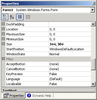 The items in the Properties window display in a list
set when installing Microsoft Visual Studio. In the beginning, you may be regularly
lost when looking for a particular property because the list is not
arranged in a strict order of rules. You can rearrange the list. For
example, you can cause the items to display in alphabetic order. To do
this, in the title bar of the Properties window, click the Alphabetic
button When a control is selected, the Properties window displays only its characteristics. When various controls have been selected, the Properties window displays only the characteristics that are common to the selected controls.
Each field in the Properties window has two sections: the property’s
name and the property's value: 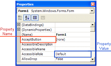 The name of a property is represented on the left column. This is the official name of the property. Notice that the names of properties are in one word. You can use this same name to access the property in code. The box on the right side of each property name represents the value of the property that you can set for an object. There are various kinds of fields you will use to set the properties. To know what particular kind a field is, you can click its name. To set or change a property, you use the box on the right side of the property’s name: the property's value, also referred to as the field's value.
Some fields expect a numeric value. In this case, you can click the name of the field and type the desired value. If you type an invalid value, you would receive a message box notifying you of the error: 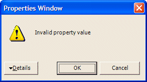 When this happens, click OK and type a valid value. If the value is supposed to be an integer, make sure you don't type it as a decimal number.
To collapse the field, click the – button. Some of the properties are numeric based, such as the Size. With such a property, you can click its name and type two numeric values separated by a comma. Some other properties are created from an enumerator or a class. If you expand such a field, it would display various options. Here is an example from the Font property: 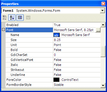 With such a property, you should select from a list.
To change the value of some of the fields, you would use their combo box to display the available values. After clicking the arrow, a list would display: 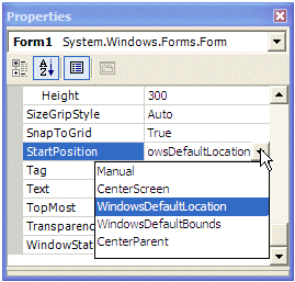 There are various types of list-based fields. Some of them display just two items. To change their value, you can just double-click the field. Some other fields have more than two values in the field. To change them, you can click their arrow and select from the list. You can also double-click a few times until the desired value is selected.
|
|
|
|
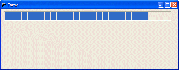
private void timer1_Tick(object sender, System.EventArgs e)
{
	this.pgrSeconds.Value = DateTime.Now.Second;
}
|
|
|
||
| Previous | Copyright © 2004-2014 FunctionX, Inc. | Next |
|
|
||