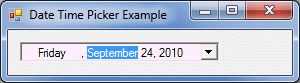
To let you programmatically create a date/time picker control, the .NET Framework provides a class named DateTimePicker. You can declare for it and initialize it using the new operator. Here is an example: using System;
using System.Drawing;
using System.Windows.Forms;
public class Exercise : System.Windows.Forms.Form
{
DateTimePicker dtpDataHired;
public Exercise()
{
InitializeComponent();
}
void InitializeComponent()
{
dtpDataHired = new DateTimePicker();
dtpDataHired.Location = new Point(12, 12);
Controls.Add(dtpDataHired);
Text = "Date Time Picker Example";
}
}
public class Program
{
static int Main()
{
System.Windows.Forms.Application.Run(new Exercise());
return 0;
}
}
To visually add a date/time picker to a form or other
container, in the Common Controls section of the Toolbox, click
DateTimePicker
After adding the date/time picker control to the form, to allow the user to set the dates and not the times on the control, set its Format property either to Long (the default) or to Short. Here is an example: using System;
using System.Drawing;
using System.Windows.Forms;
public class Exercise : System.Windows.Forms.Form
{
DateTimePicker dtpDataHired;
public Exercise()
{
InitializeComponent();
}
void InitializeComponent()
{
dtpDataHired = new DateTimePicker();
dtpDataHired.Location = new Point(12, 12);
dtpDataHired.Format = DateTimePickerFormat.Long;
Controls.Add(dtpDataHired);
Text = "Date Time Picker Example";
}
}
After adding a date time picker control and setting its Format to either Long (the default) or Short, the control becomes a combo box (the default). If you do not like the combo box, you can display a spin button instead. This characteristic is controlled by the ShowUpDown Boolean property. When its value is set to False (the default), the control appears as a combo box. It you set it to True, it appears as a spin button: 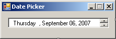
In some cases, you may want to decide when to allow the user to select a date or when to disable it. There are two ways you can do. You can use the Control's Enabled property that all other controls inherit. Another technique you can use is to display a check box on the left side of the text box section of the control. The presence or absence of the check box is controlled by the ShowCheckBox Boolean property whose default value is False. If you set it to True, a check box appears: 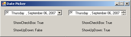 When the check box is checked, the user can change the displayed date. When the check box is unchecked, the control is displayed and the user cannot change the date. The user must first put a check mark in the check box in order to be able to change the date. The state of the check box is controlled by the Boolean Checked property. If the user clicks the check box to put a check mark in it, this property's value becomes true.
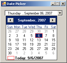
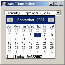
As its name indicates, the date picker either displays a date or it allows the user to specify a date. The control follows the format of the date values specified in the regional settings of Control Panel. Consequently, the date is made of various sections including the name of the day, the name of the month, the numeric day in the month, and the year. If the control is equipped with a spin button, to change the month, the user can click the month and then click one of the arrow buttons of the spin control. The user can also use the arrow keys to get the same effect. In the same way, the user can change the values of the day or the year. If the control appears as a combo box, the user can click the arrow button. This would display a calendar: When the calendar displays, the control throws a DropDown event. The DropDown event is of type EventArgs. This means that this event does not carry any significant information, other than to let you know that the calendar of the control has been dropped to display. While the calendar is displaying, the user can change the month, change the year, or click a date to select one. T user can still change the date in the text box side of the control. However it is done, on the text box or on the calendar, when the date of the control has been changed, the control fires a ValueChanged event. The ValueChanged event, which is the default event of the control, is of type EventArgs, meaning it does not give you any detail about the date that was selected or about anything the user did. You would use your own means of finding out what date the user had selected or specified. This can easily be done by getting the Value property of the control. If the control is displaying a calendar, once the user clicks a date, the calendar disappears and the control becomes a combo box again. When the calendar retracts, the control fires a CloseUp event. The CloseUp event is of type EventArgs, which means it does not carry any particular information other than letting you know that the calendar has been closed.
If the date picker control displays like a combo box, as mentioned already, if the user clicks the arrow button, a calendar appears. The calendar shares the same functionality and characteristics like the month calendar control:
This calendar displays to the bottom-left or the
bottom-right side of the combo box. To control this alignment, change the
value of the DropDownAlign property whose default value is Left.
The other value is Right.
If you want to control the range of dates the user can select, use the MinDate and the MaxDate properties as we mentioned them from the MonthCalendar control. Here is an example: using System;
using System.Drawing;
using System.Windows.Forms;
public class Exercise : System.Windows.Forms.Form
{
DateTimePicker dtpDataHired;
public Exercise()
{
InitializeComponent();
}
void InitializeComponent()
{
dtpDataHired = new DateTimePicker();
dtpDataHired.Location = new Point(12, 12);
dtpDataHired.MinDate = new DateTime(2000, 1, 1);
Controls.Add(dtpDataHired);
Text = "Date Time Picker Example";
}
}
public class Program
{
static int Main()
{
System.Windows.Forms.Application.Run(new Exercise());
return 0;
}
}
When you add the date time picker control to your form or container, it displays the date of the computer at the time the control was added. If you want the control to display a different date, set the desired value in the Value field of the Properties window. At any time, you can find out what value the Date Picker has by retrieving the value of the Value property.
If you set the Format property to Long, the date displays using the Long Date formats of Control Panel. If you set the Format to Short, the control uses the Short Date value of Control Panel. If you want to customize the way the date is displayed, set the Format property to Custom. After setting the Format to Custom, use the CustomFormat property to create the desired format. The format is created by combining the following characters:
Here is an example: using System;
using System.Drawing;
using System.Windows.Forms;
public class Exercise : System.Windows.Forms.Form
{
DateTimePicker dtpDataHired;
public Exercise()
{
InitializeComponent();
}
void InitializeComponent()
{
dtpDataHired = new DateTimePicker();
dtpDataHired.Location = new Point(12, 12);
dtpDataHired.Format = DateTimePickerFormat.Custom;
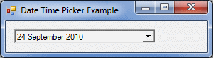
dtpDataHired.CustomFormat = "dd MMMM yyyy";
Controls.Add(dtpDataHired);
Text = "Date Time Picker Example";
}
}
public class Program
{
static int Main()
{
System.Windows.Forms.Application.Run(new Exercise());
return 0;
}
}
 This means that you should be reluctant to let the users type whatever they want. The less they type, the less checking you need to do. The Date Time Picker control uses some events that the month calendar control does not have. Whenever the user changes the date or time value of the control, a ValueChanged event fires. You can use this event to take some action such as indicating to the user that the new date is invalid. If the Format property of the control is set to Date and if the ShowUpDown property is set to False, when the user clicks the arrow of the combo box to display the calendar part of the date time picker control, the DropDown event fires. On the other hand, if the user clicks the arrow to retract the calendar, the CloseUp event fires. Both events are of EventArgs type.
|
||||||||||||||||||||||||||||||||||||||||||||||||||||||||||||||||||||||||||
 and click the host. The date/time picker control can be considered as two
controls in one: you just have to choose which one of both controls you want
to use.
and click the host. The date/time picker control can be considered as two
controls in one: you just have to choose which one of both controls you want
to use.